Analyzing 2 Customers with Horizontal Bar Chart
RJ0800016_4
- Last Update 08/04/2025
- File Size 1.5MB
- # of Slides 2
- File Format PPTX
- Slide Ratio 16:9
- Color
Keywords
- #Content-Based Slides
- #Design-Based Slides
- #Company Introduction
- #Market and Competitor Analysis
- #Graph
- #Manpower
- #Customer Analysis
- #Horizontal Bar
- #Horizontal Bar Chart
- #16:9
- #horizontal bar chart PowerPoint
- #customer analysis slide template
- #comparison chart presentation
- #business analytics slides
- #market research PowerPoint template
About the Product
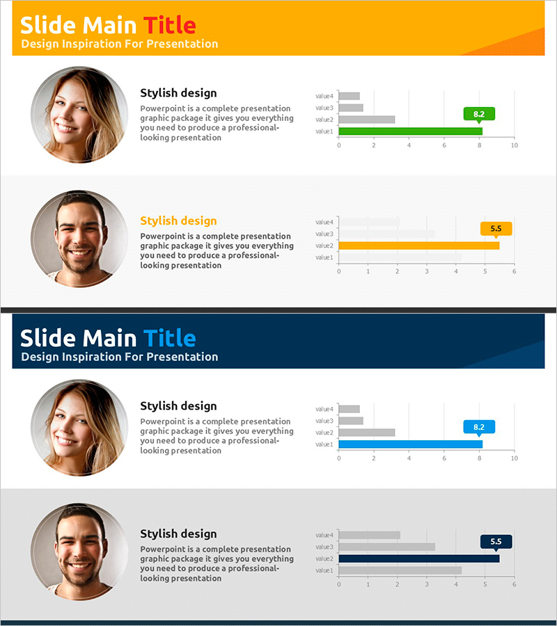
A horizontal bar chart PowerPoint slide optimized for customer analysis and market research presentations. This slide compares two customers across four metrics (value1 through value4), enabling clear visual comparison of numerical data. The design uses distinct orange and blue color schemes to differentiate the two customer profiles, making data interpretation intuitive. Circular profile image areas and descriptive text are positioned alongside the chart for comprehensive information delivery. The 16:9 widescreen format includes 2 slides ready for immediate use and editing.
Usage Points
-
Main Usage
Visualize customer characteristic comparisons and market research findings. Ideal for sales reports, marketing strategy presentations, and business analysis decks where quantitative data comparison between two customer segments supports decision-making.
-
How to Use
Replace customer names, metric labels (value1–value4), and numerical values with your actual analysis data. The orange and blue bars automatically distinguish between customers. Profile image areas accept customer photos or logos. Colors and values are fully customizable to match your presentation theme.
-
Recommended For
Sales teams presenting customer analysis reports, marketing teams comparing target customer segments, executive briefings, consulting proposals, and market research presentations. Particularly effective when quantitatively comparing two customer groups or market segments.
-
Slide Structure
2-slide deck. Each slide features a title area with orange header, left-side circular profile image zone, center text description area, and right-side horizontal bar chart with 4 metrics (0–10 scale). Bars are color-coded by customer (orange/blue), with numerical labels displayed at the end of each bar.
Related Products
-

Graph Slide for User Data Analysis – Visual Trends and Appeal
#Company Introduction #Market and Competitor Analysis #Diagram
-

Key Personnel Ability Analysis Graph – Highlighting Company Core Strengths
#Company Introduction #Market and Competitor Analysis #Graph
-

Paint Splash Presentation Template for Team Members
#Company Introduction #Market and Competitor Analysis #Graph
-

Triangular Pattern Template for horizontal Bar Chart – Market and Competitive Analysis
#Company Introduction #Market and Competitor Analysis #Graph
