Donut-type Satisfaction Graph – Ambitious Visual Element
RJ0800012_14
- Last Update 08/03/2025
- File Size 0.2MB
- # of Slides 2
- File Format PPTX
- Slide Ratio 16:9
- Color
Keywords
About the Product
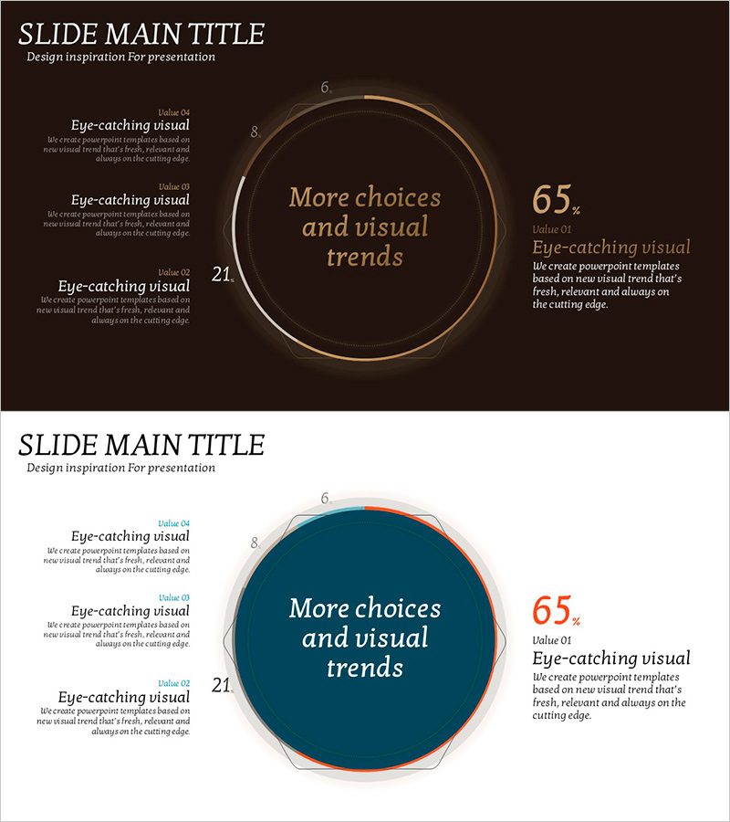
A donut-shaped satisfaction graph PowerPoint slide featuring a circular data visualization design. The central circular area emphasizes the key metric (65%), while surrounding text elements display detailed satisfaction scores. The design combines a dark brown background with gold border accents and white typography to convey a premium presentation style. This 2-slide template is ready to use for various business presentations. Ideal for customer satisfaction surveys, performance reports, achievement metrics, and data-driven business communications.
Usage Points
-
Main Usage
This slide effectively visualizes single-metric data such as customer satisfaction, performance achievement rate, or goal completion percentage. The central circular area draws attention to the key figure, while surrounding text provides detailed context. Perfect for reports, analytical presentations, and executive briefings that require data-driven communication.
-
How to Use
Edit the central metric (65%) to reflect your actual data and customize the surrounding text items to match your presentation content. The dark brown background and gold border maintain a professional appearance suitable for corporate reports and executive presentations. When modifying colors, maintain sufficient contrast between background and border elements for optimal readability.
-
Recommended For
Executives, marketing managers, data analysts, project managers, and sales leaders presenting performance metrics, customer satisfaction analysis, and goal achievement rates. Suitable for quarterly and annual performance reviews, investor presentations, and management meetings across finance, consulting, manufacturing, and service industries.
-
Slide Structure
2-slide template with each slide featuring a central donut chart (single data series, 65% data point) and surrounding text areas (3-4 items). Dark brown background with gold circular border, white typography, and numeric labels (6, 8, 21) arranged to represent data hierarchy.
Related Products
-

AI VC Market Statistics PowerPoint Slide – Bar Chart and KPI
#Market and Competitor Analysis #Financial Plans and Performance #Graph
-

Competitor Analysis Broken Line Graph – Exploring Competitive Advantage in the Market
#Market and Competitor Analysis #Graph #Competitor Analysis
-

Green & Gray Template Wide Vertical Bar Chart – Performance Visualization
#Company Introduction #Business Strategy #Graph
-

Highlighting Competitive Advantage with Comparative Bifurcated Bar Chart
#Market and Competitor Analysis #Graph #Competitive Advantage
