Sky Blue Orange Bar Chart – Visual Data Comparison
RJ0800011_9
- Last Update 08/03/2025
- File Size 0.3MB
- # of Slides 2
- File Format PPTX
- Slide Ratio 16:9
- Color
Keywords
About the Product
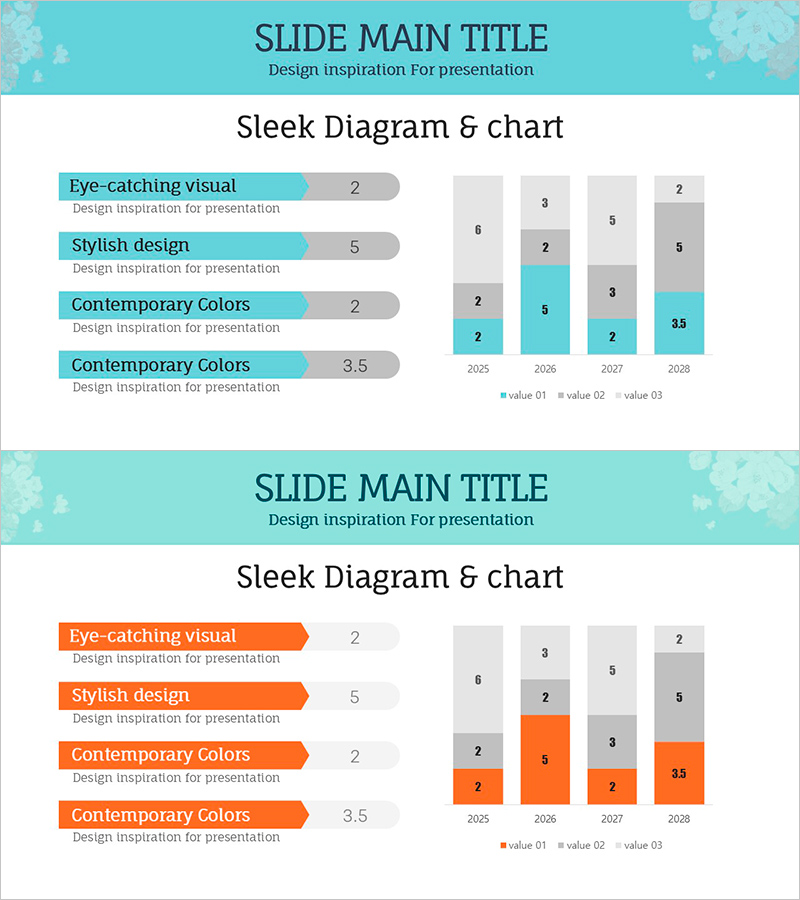
A stacked bar chart PowerPoint slide designed to visually compare data trends across four years (2025–2028). The slide features a dual-color scheme combining sky blue and orange to clearly distinguish three data series, with a left-aligned item list and right-aligned chart layout for optimal information flow. Perfect for business performance reports, sales analysis, marketing metrics, and financial presentations. All elements are fully editable in 16:9 PPTX format, enabling quick customization for your specific data and messaging.
Usage Points
-
Main Usage
This slide enables side-by-side comparison of multi-series data across time periods while displaying both individual values and cumulative totals. Ideal for presenting quantitative insights in executive reports, quarterly performance reviews, budget allocation, and revenue analysis. The stacked format allows viewers to see both component breakdown and overall trends simultaneously.
-
How to Use
Replace the left-side item labels and values with your own data categories and metrics. Update the chart data on the right to reflect your actual figures for each year and series. The sky blue and orange color scheme can be retained for brand consistency or modified to match your corporate colors. Adjust year labels, series names, and numerical values as needed. Use both slides consecutively for enhanced comparative impact.
-
Recommended For
Executive dashboards, quarterly business reviews, marketing performance reports, financial statements, project status updates, and investor presentations. Particularly effective when comparing performance across multiple departments, product lines, regions, or business units. Recommended for consulting proposals, pitch decks, and strategic planning documents where quantitative evidence strengthens credibility.
-
Slide Structure
Slide 1: Sky blue-toned background with stacked bar chart. Left side displays four items in list format with numerical ratings. Right side shows 4-year stacked bars (2025–2028) with three color-coded series (value 01, 02, 03). Slide 2: Orange-toned background with identical layout and structure, creating visual contrast for comparison emphasis and reinforcing data analysis narrative.
Related Products
-

Visualizing Company Sales with Vertical Bar Chart – Sharing Trust and Success
#Company Introduction #Business Introduction #Graph
-

Trend Color Wide Template - Segmentation Horizontal Bar Graph
#Company Introduction #Market and Competitor Analysis #Graph
-

Battery Type Analysis Graph – Market and Competitor Data Visualization
#Market and Competitor Analysis #Graph #Competitor Analysis
-

User Analysis Graph by Age Group – Advanced Data Insights
#Market and Competitor Analysis #Diagram #Graph
