Space Industry Analysis Graph – Market and Competitor Analysis
RJ0700013_7
- Last Update 07/25/2025
- File Size 1.1MB
- # of Slides 2
- File Format PPTX
- Slide Ratio 16:9
- Color
Keywords
About the Product
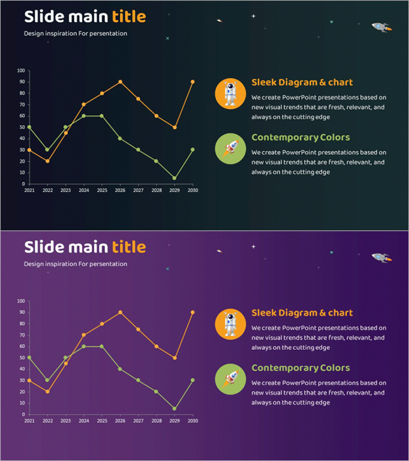
A dual-series line chart PowerPoint slide designed for space industry market analysis and competitive benchmarking. Visualizes data trends from 2021 to 2030 with orange and green data lines on a dark background (navy and purple tones). Each slide features two circular icons on the right side to highlight key insights. Provided in 16:9 PPTX format, this slide template is ready for immediate use in business presentations including competitor analysis, market trend comparisons, and performance tracking across industries.
Usage Points
-
Main Usage
Optimized for comparing two or more data series and visualizing trend changes over time. Effectively displays market size evolution, competitor performance comparison, revenue trends, customer growth, and other time-series metrics across space industry, technology, finance, and marketing sectors.
-
How to Use
Replace Y-axis values and X-axis years with your own data. Modify the circular icon text to clarify each data series, and adjust line colors if needed. The dark background ensures excellent readability in projector environments and maintains visual impact in both digital and printed formats.
-
Recommended For
Ideal for executive reports, investor presentations, market analysis briefings, competitive benchmarking, quarterly performance reviews, and technology trend analysis. Particularly suited for strategy meetings and external presentations in data-driven industries such as aerospace, IT, manufacturing, and finance.
-
Slide Structure
Two-slide set with each slide featuring a dual-series line chart on the left (10+ data points spanning 10 years) and two circular icons with descriptive text on the right. Dark background (navy and purple) with orange and green lines for contrast emphasis. Grid lines and axis labels support accurate data interpretation.
Related Products
-

Blue Green Broken Line Graph – Optimized for Competitor Analysis Design
#Market and Competitor Analysis #Graph #Competitor Analysis
-

Curved Graphs and Analysis Messages – Market and Competitor Analysis
#Market and Competitor Analysis #Graph #Competitor Analysis
-

VR Business Market Analysis Broken Line Graph – Competitive Advantage and Trend Analysis
#Market and Competitor Analysis #Graph #Competitor Analysis
-

Competitor Progress Comparison Analysis Graph – Essential Tool for Market Analysis
#Market and Competitor Analysis #Graph #Competitor Analysis
