Climate Change Data Analysis Graph
RL0100043_3
- Last Update 01/20/2025
- File Size 2.3MB
- # of Slides 2
- File Format PPTX
- Slide Ratio 4:3
- Color
Keywords
About the Product
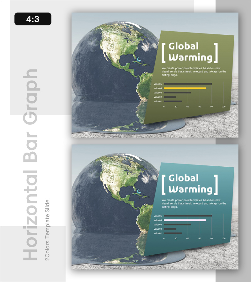
A PowerPoint slide that visually analyzes global warming and climate change trends using horizontal bar graphs. Available in two color options—olive green and teal—this presentation slide features five data items displayed as comparative bars from 0 to 100. The earth image positioned on the left creates a compelling visual context for environmental impact messaging. Formatted in 4:3 ratio PPTX with 2 slides, the layout clearly separates descriptive text from data visualization, making it ready for immediate use in presentations. Ideal for climate policy briefings, sustainability reports, ESG disclosures, and environmental risk assessments.
Usage Points
-
Main Usage
This slide presents climate change and global warming data in a data-driven, persuasive format. It is designed for environmental policy briefings, sustainability reporting, ESG disclosures, climate risk analysis, and scientific presentations where comparative data visualization is essential to support decision-making.
-
How to Use
Enter your presentation title and key message in the text area on the left side of the slide, then input your actual data values into the five bar graph items. Choose between the olive green or teal color version to match your organization's brand identity. Place this slide in the introduction or analysis section of your climate-focused presentation.
-
Recommended For
Environmental policy officers, sustainability report writers, ESG executives, climate researchers, environmental NGO advocates, government officials, university environmental science instructors, and corporate CSR managers who need to communicate climate data with visual impact and credibility.
-
Slide Structure
The 2-slide set features a three-section layout: earth image on the left, descriptive text area in the center, and horizontal bar graph on the right. Each graph displays five data items (value01–value05) on a 0–100 scale using olive green or teal bars for emphasis. The text input area includes one title field and one description field, creating a clean, uncluttered information hierarchy suitable for data-focused presentations.
Related Products
-

Future-oriented Template Cover – Bright Vision Ahead
#Emotional Messages
-

Corporate Future Outlook Analysis Graph – Visualizing Future Predictions
#Emotional Messages
-

AI Innovation Business Ideas Slide – Creative Visualization
#Emotional Messages
-

Business Idea Analysis Graph – Innovation and Vision
#Emotional Messages
