Corporate Future Outlook Analysis Graph – Visualizing Future Predictions
RL0100017_3
- Last Update 01/19/2025
- File Size 0.8MB
- # of Slides 2
- File Format PPTX
- Slide Ratio 4:3
- Color
Keywords
About the Product
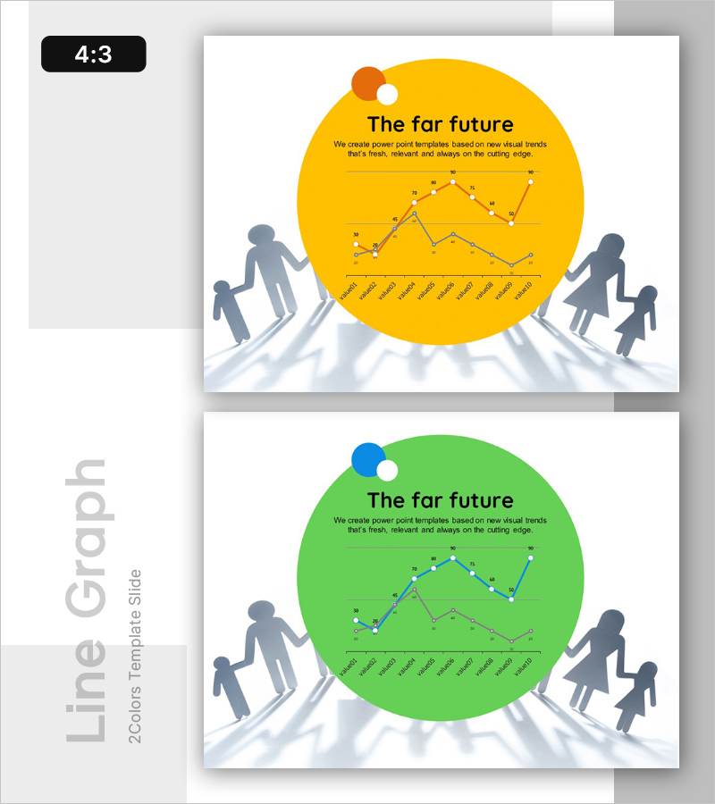
A 2-slide PowerPoint presentation for visualizing corporate future outlook and trend analysis. Available in yellow and green color variants, each slide features a large circular background with dual-line chart displaying two data series. Silhouette figures positioned on both sides symbolize forward momentum and strategic direction. Clear title and description text areas frame the data visualization. This presentation slide is ready to use for market forecasting, growth projections, competitive analysis, and strategic planning in investor pitches, executive reports, and board meetings.
Usage Points
-
Main Usage
Visualize corporate growth trajectories, market forecasts, and competitive benchmarking using dual-line charts to support data-driven decision-making. Ideal for investor presentations, executive briefings, and strategic planning sessions where quantitative insights and future projections need clear visual communication.
-
How to Use
Replace chart data points and axis labels with actual business metrics and timeframes. Edit the title and description text areas to reflect your analysis topic and key message. Select either the yellow or green color variant to match your corporate branding and presentation theme.
-
Recommended For
Executives, finance teams, strategy planners, and marketing professionals presenting quarterly or annual performance reviews, market trend reports, and forward-looking business plans. Suitable for investor relations, partner collaboration proposals, and internal management meetings requiring data-backed strategic decisions.
-
Slide Structure
Each slide contains a title section (The far future) with descriptive text at the top, a dual-line chart in the center showing two data series with data point markers, and a time-axis label row at the bottom (monthly or quarterly intervals). Silhouette figures on both sides provide visual balance. Three editable text areas (title, description, chart) create clear information hierarchy.
Related Products
-

Introducing Positive Future Services – Creative Vision
#Emotional Messages
-

Future Vision Diagram – Visualizing Business Strategy and Vision
#Emotional Messages
-

Business Outlook Template Ending Cover – Modern Sensibility
#Emotional Messages
-

Potential Template Cover – A Professional and Emotional Start
#Emotional Messages
