Brown Pie Chart Set – Effective Communication through Data Visualization
RJ0600096_19
- Last Update 07/16/2025
- File Size 0.1MB
- # of Slides 2
- File Format PPTX
- Slide Ratio 16:9
- Color
Keywords
About the Product
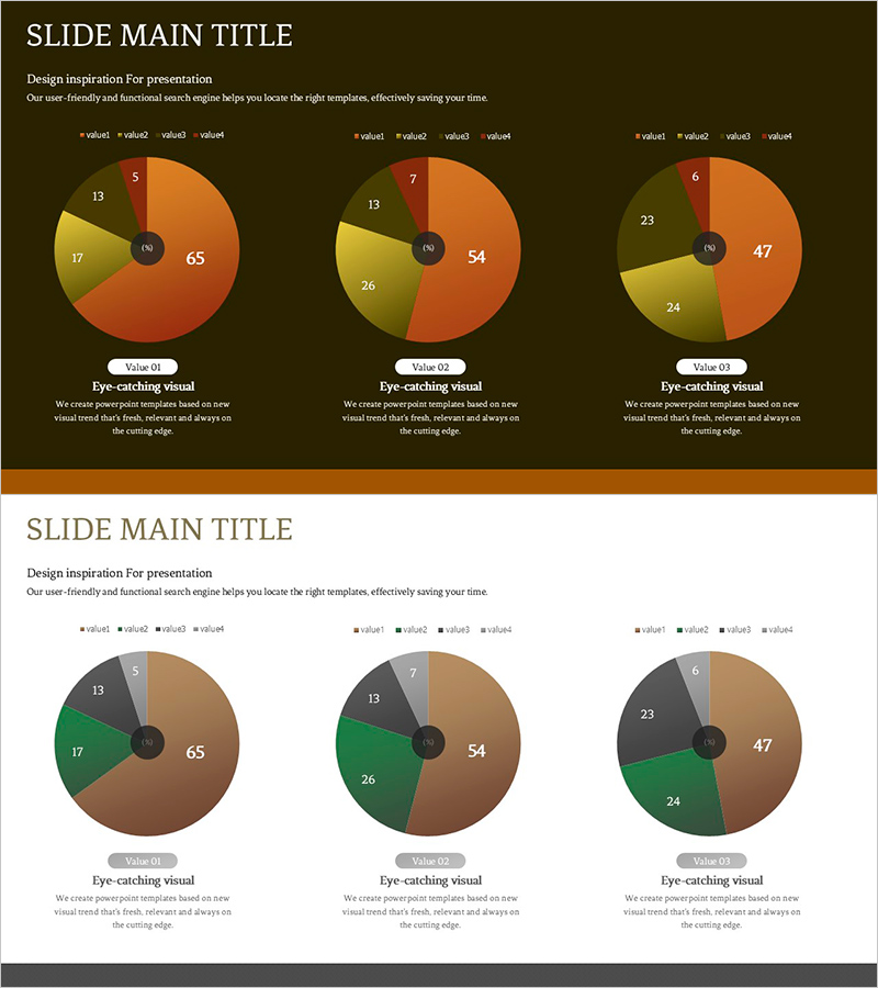
A professional pie chart PowerPoint slide set featuring warm brown and orange tones for effective data visualization. Each slide displays three circular graphs divided into 4-5 segments with clear numerical labels and legends positioned around the center node. The intuitive layout makes it ideal for comparing proportions, analyzing market share, and presenting budget allocations in business presentations, reports, and pitch decks. The color scheme conveys trust and stability while maintaining visual clarity for audience comprehension.
Usage Points
-
Main Usage
Visualize part-to-whole relationships such as sales distribution, market share, budget allocation, and customer demographics. The warm brown color palette establishes credibility and stability, making it suitable for financial reports, strategic presentations, and executive briefings.
-
How to Use
Input your data values into each pie chart and the proportions automatically adjust. Customize legends, labels, and text to match your presentation content. Colors and fonts are fully editable to align with your brand guidelines.
-
Recommended For
Finance professionals, marketing managers, business analysts, consultants, and executives presenting quarterly results, investment pitches, market analysis, and strategic planning in corporate settings.
-
Slide Structure
2-slide set with 3 pie charts per slide arranged horizontally. Each chart features 4-5 segments with numerical values at the center node and corresponding legends and descriptive text positioned around the perimeter.
Related Products
-

Structure Presentation Template Column Chart – Essential Tool for Market and Competitor Analysis
#Market and Competitor Analysis #Graph #Competitor Analysis
-

Key Performance Analysis Bar Graph – Visualization of KPIs
#Company Introduction #Market and Competitor Analysis #Graph
-

Pie Chart Composition Ratio Analysis – Market Status and Competitive Insights
#Market and Competitor Analysis #Graph #Market Status
-

Vertical Bar Chart Visualizing Monthly Performance – Contemporary Design
#Product/Service Introduction #Market and Competitor Analysis #Graph
