Economic Consumption Analysis Graph by Year
RL0100039_3
- Last Update 01/20/2025
- File Size 1.8MB
- # of Slides 2
- File Format PPTX
- Slide Ratio 4:3
- Color
Keywords
About the Product
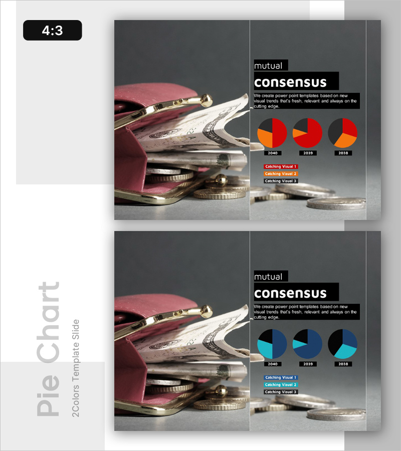
A PowerPoint slide for economic consumption analysis by year, featuring three pie charts comparing 2040, 2039, and 2038 consumption patterns in red, orange, and gray. The left side displays a wallet and coins image emphasizing financial themes, while the right side arranges title, description, and legend in a two-column layout. Available in 4:3 ratio PPTX format for immediate editing. Perfect for economic analysis presentations, market research reports, and consumer trend discussions.
Usage Points
-
Main Usage
Compare year-over-year consumption patterns using pie charts to clearly communicate market trends to decision-makers. This core slide enhances data credibility in economic reports, market analysis, and consumer trend presentations.
-
How to Use
Insert finance-related imagery in the left image area and replace pie chart values and legend with actual data. Use the year-over-year comparison structure to emphasize changes over time, explaining key factors driving each year's variations during presentation.
-
Recommended For
Economists, marketing managers, finance team leads, and executives. Ideal for quarterly and annual economic trend reports, consumer behavior analysis, market share change explanations, and investment decision-making materials.
-
Slide Structure
Two-slide layout: left 50% image area (wallet and coins photo), right 50% data area (title, description, three pie charts, legend). Each pie chart contains 3-4 segments with four text input areas (title, description, three legend lines) providing clear information hierarchy.
Related Products
-

AI Innovation Business Ideas Slide – Creative Visualization
#Emotional Messages
-

Research Status Analysis Graph – Insights on Market and Competitors
#Emotional Messages
-

Radical Social Advancement – Innovation through Visual Appeal
#Emotional Messages
-

Business Idea Analysis Graph – Innovation and Vision
#Emotional Messages
