Visualizing Performance with 3 Vertical Bar Graphs – Market and Competitor Analysis
RJ0600094_26
- Last Update 07/16/2025
- File Size 0.4MB
- # of Slides 2
- File Format PPTX
- Slide Ratio 16:9
- Color
Keywords
- #Content-Based Slides
- #Design-Based Slides
- #Business Strategy
- #Market and Competitor Analysis
- #Graph
- #Achievements
- #Competitor Analysis
- #Column
- #Column Chart
- #16:9
- #vertical bar chart PowerPoint
- #bar graph slide template
- #data comparison chart
- #market analysis PowerPoint slide
- #performance metrics visualization
About the Product
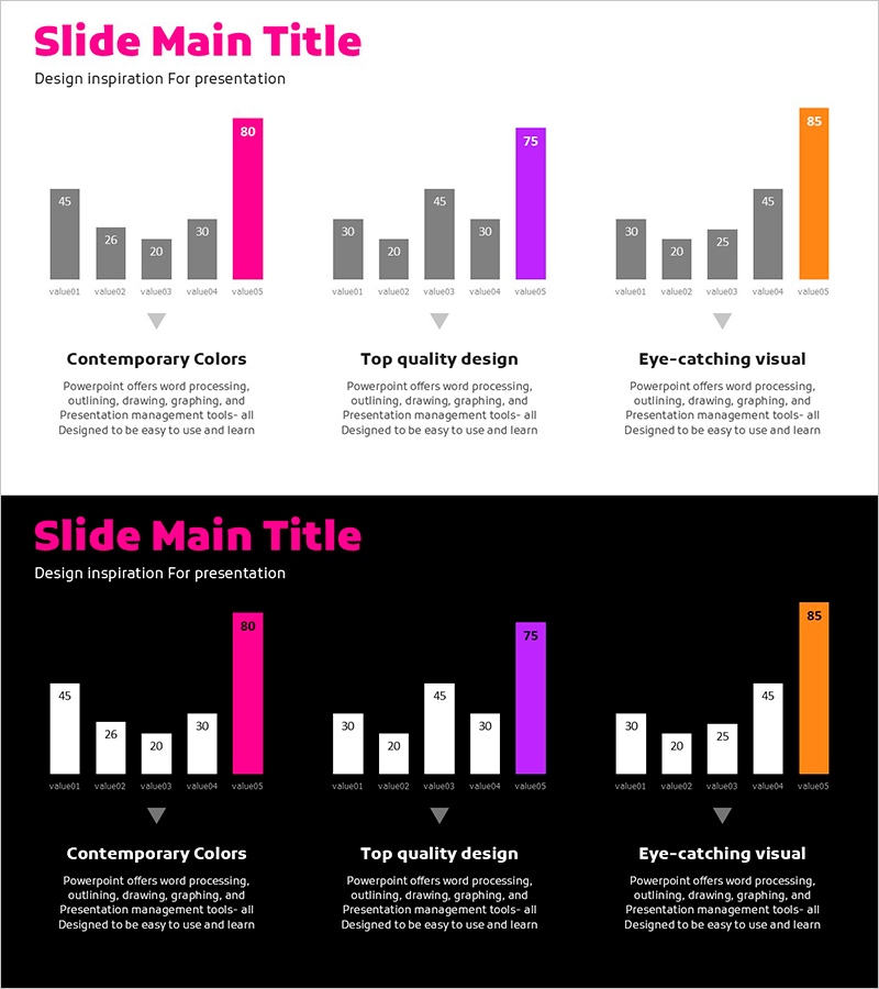
A PowerPoint slide featuring three vertical bar charts arranged side by side for direct data comparison. Ideal for visualizing market analysis, competitor benchmarking, and performance metrics across multiple data series. Each chart displays five data points with distinct magenta, purple, and orange accent colors to highlight key values. Two versions included: light background for print and PDF distribution, dark background for screen presentations. Fully editable in PowerPoint with automatic chart updates when you modify the underlying data values.
Usage Points
-
Main Usage
Enables simultaneous comparison of three data series in business presentations. Perfect for displaying market size versus competitor performance versus company results, or comparing quarterly, annual, or regional performance metrics. Strengthens credibility through data-driven visual communication.
-
How to Use
Replace the five item labels and numerical values with your own data. Reassign the magenta, purple, and orange accent colors to emphasize the most important data series or to represent different categories. Use the light background version for printed materials and the dark background version for on-screen presentations.
-
Recommended For
Executive reports, business plans, marketing proposals, investor pitch decks, quarterly and annual performance reviews. Finance teams, marketing departments, and strategy teams frequently use this layout for data-driven decision support. Also suitable for academic presentations and market research findings.
-
Slide Structure
Two-slide layout: Slide 1 features light background with three vertical bar charts; Slide 2 uses dark background with identical structure. Each chart represents five data points (value01–value05) with magenta (80), purple (75), and orange (85) accent colors assigned to individual series. 16:9 widescreen format, PPTX file type compatible with all PowerPoint versions.
Related Products
-

Touch Wide Slide Template for Market Analysis with Vertical Column Chart
#Business Strategy #Market and Competitor Analysis #Graph
-

Travel Competitor Analysis Vertical Bar Graph – Business Strategy
#Business Strategy #Graph #Financial Outlook & Expected Impact
-

Visualizing Successful Business Performance with Horizontal Bar Chart
#Company Introduction #Business Strategy #Graph
-

Color Highlight Vertical Bar Graph – Market Competition Analysis
#Market and Competitor Analysis #Graph #Competitor Analysis
