Team Collaboration Comparison Pie Chart – Effective Data Visualization
RL0100031_2
- Last Update 01/20/2025
- File Size 1.6MB
- # of Slides 2
- File Format PPTX
- Slide Ratio 4:3
- Color
Keywords
About the Product
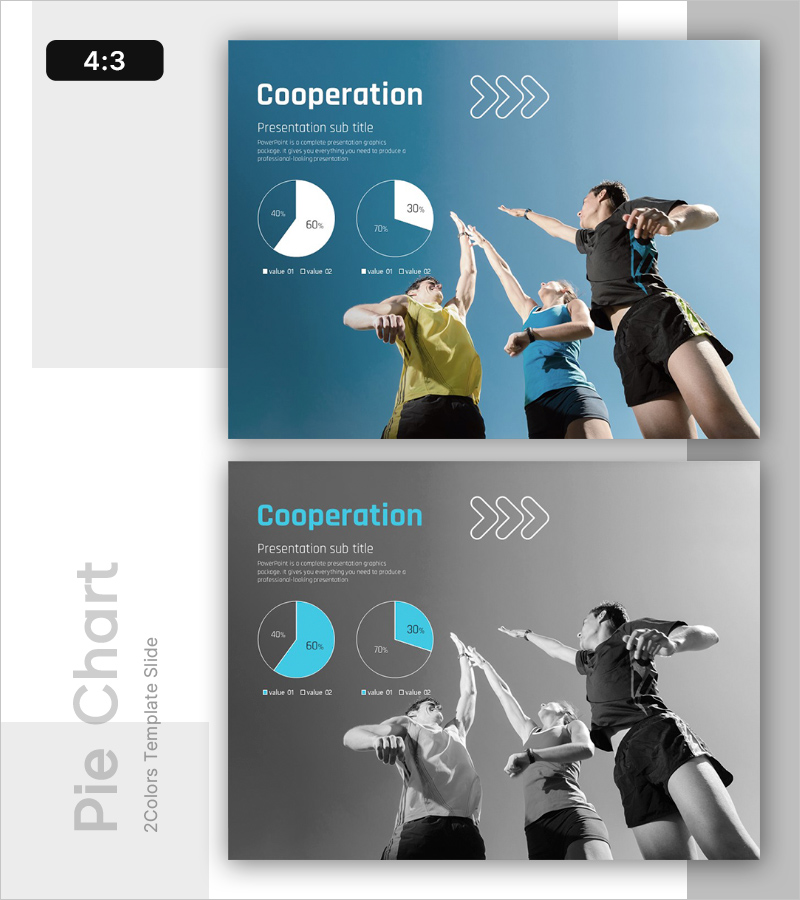
A 2-slide PowerPoint presentation showcasing team collaboration and engagement metrics through dual pie charts. The blue gradient background features two pie charts with distinct color segments, enabling clear comparison of team participation rates, role distribution, and collaboration levels. Team imagery and arrow icons emphasize the direction and flow of cooperation. The 4:3 aspect ratio ensures compatibility across all presentation environments. With clearly defined text input areas and legends, data modification is straightforward. Ready to use in company introductions, business performance reports, and team achievement presentations.
Usage Points
-
Main Usage
Visualize team collaboration metrics, participation rates, and role distribution through dual pie charts. This slide enables quantitative data presentation that allows stakeholders to quickly assess team performance and cooperation levels at a glance.
-
How to Use
Use in company introduction presentations to explain team structure and collaboration framework. Apply in business performance reports to compare team achievements and engagement metrics. Incorporate in organizational culture and team-building presentations to quantify collaboration indicators. Simply replace chart values and legend labels with your own data.
-
Recommended For
HR professionals, organizational development teams, project managers, team leaders, executive report presenters, and organizational culture specialists presenting team collaboration metrics. Suitable for internal meetings, external presentations, and investor briefings.
-
Slide Structure
Slide 1: Title (Cooperation) + subtitle + 2 pie charts (each with 2 legend items) + team image + arrow icons. Slide 2: identical layout in grayscale tone. Contains 3 text input areas (title, subtitle, description) and 4 chart input areas (pie values and legends).
Related Products
-

Positive Conversation Style – Practical Intro
#Emotional Messages
-

Work Environment Satisfaction Analysis Graph – Market Share Statistics
#Emotional Messages
-

The Peak of Happiness Diagram – Visualizing Product Characteristics and Components
#Emotional Messages
-

Family Bond Analysis Graph
#Emotional Messages
