Work Environment Satisfaction Analysis Graph – Market Share Statistics
RL0100033_3
- Last Update 01/20/2025
- File Size 1.3MB
- # of Slides 2
- File Format PPTX
- Slide Ratio 4:3
- Color
Keywords
About the Product
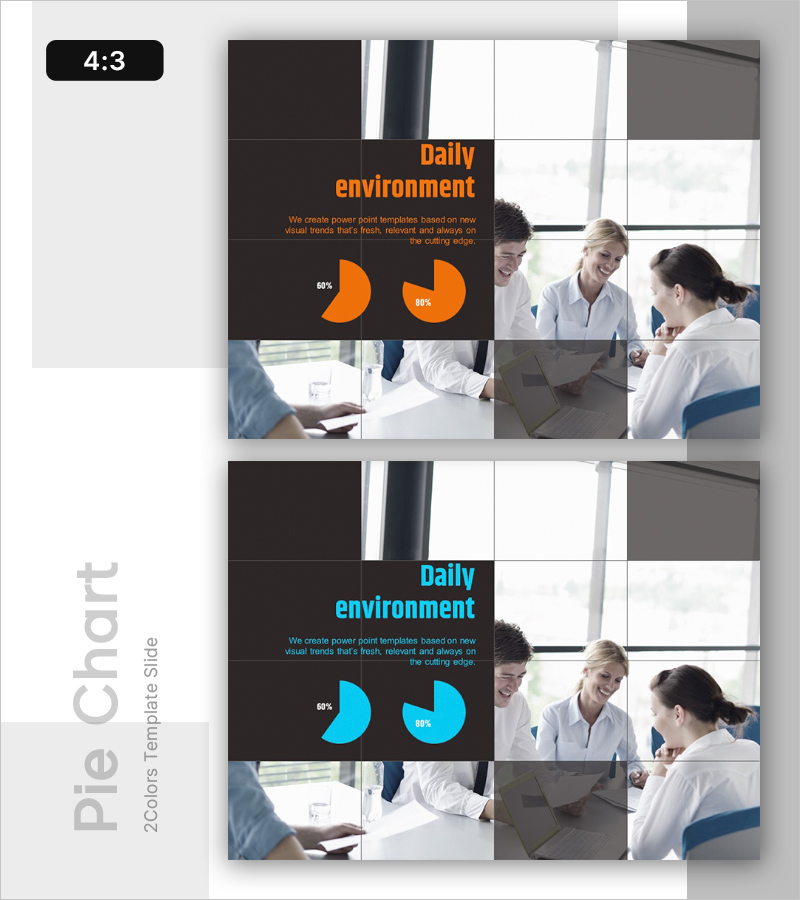
A PowerPoint slide that visualizes employee work environment satisfaction using pie charts. Available in two color options—orange and cyan—with each slide emphasizing specific metrics such as 60% and 80%. The layout balances text description areas with pie charts, making it immediately applicable for presenting internal satisfaction survey results, employee welfare status, and organizational culture analysis. The slide is built with editable shapes, allowing you to freely modify percentages and colors. Delivered in 4:3 aspect ratio PPTX format, compatible with all PowerPoint versions.
Usage Points
-
Main Usage
Communicate employee work environment satisfaction survey results to executives and staff through clear pie chart visualization. The metric-focused layout (60%, 80%) enables quick comprehension of organizational culture status, employee welfare levels, and improvement priorities.
-
How to Use
Use in internal satisfaction survey presentations, HR department organizational culture improvement reports, executive briefings, and employee communication sessions. Orange suits positive-toned presentations while cyan conveys formality and trust. Modify percentages to compare satisfaction across multiple dimensions.
-
Recommended For
HR professionals, organizational development specialists, executives, and team leaders sharing employee satisfaction insights and discussing culture improvement strategies. Ideal for regular executive meetings, all-hands town halls, and organizational culture initiative kickoffs requiring data-driven decision support.
-
Slide Structure
Two-slide set with each slide featuring a title area (Daily environment), central text description zone (3–4 lines), and dual pie charts at the bottom (showing 60% and 80% metrics). Dark background on the left contrasts with image grid on the right, creating clear information hierarchy. All shapes are fully editable for custom colors, percentages, and text modifications.


