Basic Line Chart and Analytical Text – Clarity in Data Visualization
RJ0600042_9
- Last Update 07/02/2025
- File Size 0.4MB
- # of Slides 2
- File Format PPTX
- Slide Ratio 16:9
- Color
Keywords
About the Product
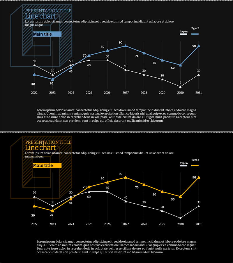
A 2-slide PowerPoint presentation featuring dual-series line charts for comparing data trends over time. The slides display 10-year data progression from 2022 to 2031 with two distinct lines, each labeled with precise numerical values at data points for accurate reference. The first slide uses a blue color scheme while the second employs a gold accent palette, both set against dark backgrounds for enhanced visibility during presentations. These line chart slides are ideal for business reports, performance analysis, market trend presentations, and financial forecasting. The dual-theme design allows flexibility in matching different presentation contexts and corporate branding requirements.
Usage Points
-
Main Usage
Visualize and compare two data series over time to communicate trends, growth patterns, and performance metrics. Ideal for presenting sales progression, growth rate comparisons, market share evolution, and actual performance versus targets in a clear, comparative format.
-
How to Use
Replace the sample data points and line values with your actual figures. The blue theme suits technical and financial presentations, while the gold theme works well for executive briefings and investor relations. Clearly label the legend (Type A and Type B) so audiences can easily distinguish between the two data series.
-
Recommended For
Financial analysts, marketing managers, business development professionals, consultants, and researchers presenting quarterly or annual performance reports, market analysis, strategic planning sessions, and comparative data analysis. Suitable for any business presentation requiring multi-series trend comparison.
-
Slide Structure
Each slide contains a title area, legend (Type A and Type B), X-axis (years 2022–2031), Y-axis (0–90 scale), two line graphs with distinct colors, numerical labels at each data point, and a descriptive text section at the bottom. Formatted in 16:9 widescreen for modern presentation environments.
Related Products
-

Visualization of Competencies and Team Members – Insightful Horizontal Bar Graph
#Company Introduction #Graph #Manpower
-

Gender Ratio Bar Graph – Market and Competitor Analysis
#Market and Competitor Analysis #Graph #Competitor Analysis
-

Progress Donut Chart – Visual Aid for Market Analysis
#Market and Competitor Analysis #Graph #Other
-

Stack Bar Chart Map for Market and Competitor Analysis
#Market and Competitor Analysis #Marketing Plan and Strategy #Graph
