Proportional Graph by Meat Part – Market Analysis Insights
RJ0600041_11
- Last Update 07/01/2025
- File Size 0.7MB
- # of Slides 2
- File Format PPTX
- Slide Ratio 16:9
- Color
Keywords
- #Content-Based Slides
- #Design-Based Slides
- #Market and Competitor Analysis
- #Diagram
- #Graph
- #Other
- #Market Share
- #Market Analysis
- #Cluster
- #Chain Diagram
- #16:9
- #pie chart PowerPoint
- #proportional graph slide
- #ratio chart template
- #data visualization presentation
- #how to create pie chart in PowerPoint
About the Product
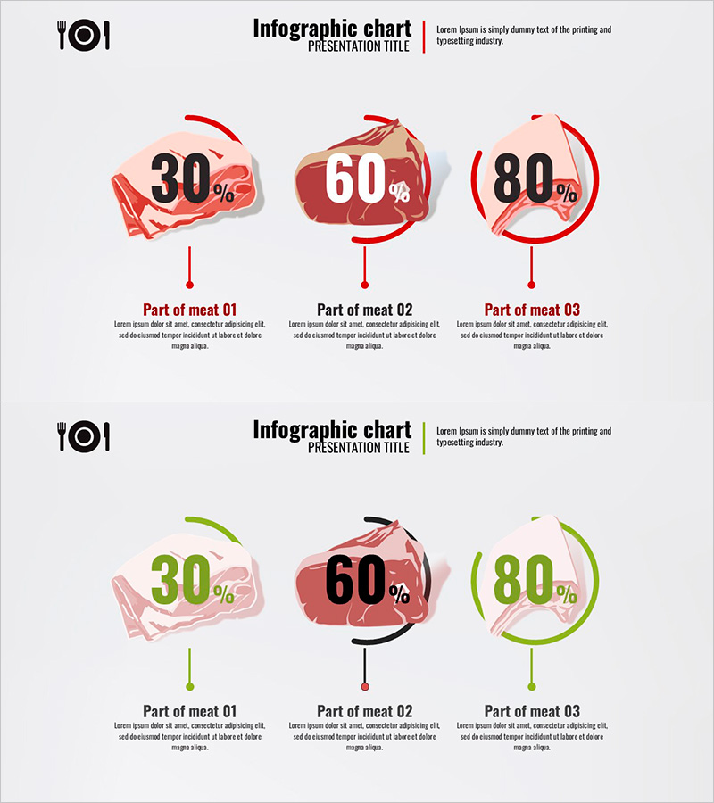
A PowerPoint slide featuring proportional pie charts with meat illustrations to visualize market analysis and product composition. The design displays three ratio values (30%, 60%, 80%) using red, brown, and pink meat illustrations combined with circular arrows for intuitive data comparison. Two layout variations—red and green color schemes—allow flexible selection based on presentation context. Ideal for market share, sales composition, and customer distribution analysis. Provided in 16:9 widescreen PPTX format with fully editable elements.
Usage Points
-
Main Usage
Clearly express the proportional relationship of three data items using pie chart visualization. The combination of meat illustrations and circular arrows makes it ideal for food, distribution, and marketing presentations requiring comparative data display.
-
How to Use
Edit the percentage values, labels, and description text fields to match your data. Use the red color scheme for emphasis and urgency, or the green scheme for growth and positive messaging. Both layouts maintain identical structure for consistent presentation flow.
-
Recommended For
Marketing managers, sales teams, product planners, and market analysts presenting ratio data to clients, executives, and investors. Particularly effective for food industry product composition, retail market analysis, sales performance reports, and distribution channel breakdowns.
-
Slide Structure
Each slide contains three pie chart sections with percentage values, meat illustrations, circular directional arrows, labels, and description text areas. Two slides with identical structure but different color palettes (red and green) provide flexible design options.
Related Products
-

Market Share Visualization of Three Countries – Effective Data Analysis
#Market and Competitor Analysis #Graph #Other
-

Donut Chart & Map Template for Social Network Visualization
#Market and Competitor Analysis #Graph #Other
-

Target Market Share Analysis – Visualizing Market Analysis with Pie Chart
#Market and Competitor Analysis #Graph #Other
-

Camping Market Trend Survey Line Graph – Trend Displayed in Orange and Yellow
#Market and Competitor Analysis #Graph #Other
