Communication Analysis Chart – Essential for Data Visualization
RL0100013_3
- Last Update 01/19/2025
- File Size 1.2MB
- # of Slides 2
- File Format PPTX
- Slide Ratio 4:3
- Color
Keywords
About the Product
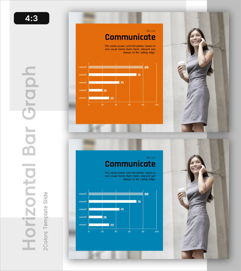
This slide features horizontal and vertical bar charts designed for communication analysis, focusing on vivid data visualization. With a vibrant orange and blue combination, it clearly presents the performance of each data item. This template is highly effective for market analysis and competitive analysis reports, and the text and graph elements are easily replaceable, categorized as 'easy' editing difficulty. Use this slide to convey analysis results clearly and provide insights needed for strategy formulation.
Usage Points
-
Main Usage
- This template is ideal for presenting data insights during team meetings or client presentations, enabling a clear interpretation of complex information for decision-making purposes.
-
How to Use
- Utilize this template during quarterly review sessions to demonstrate performance trends or while preparing market research presentations to illustrate competitive positioning effectively. It can also be adapted for educational settings to help students visualize statistical data.
-
Recommended For
- This template is particularly suitable for business analysts, marketing professionals, and educators who need to report findings or present analytical insights to stakeholders or students.
-
Slide Structure
- The overall design incorporates a combination of horizontal and vertical charts, allowing for a comprehensive comparison of various metrics. The layout facilitates a logical flow from data introduction to detailed analysis, ensuring that the audience can follow along effortlessly.
Related Products
-

The Peak of Happiness Diagram – Visualizing Product Characteristics and Components
#Emotional Messages
-

Family Unity Program – Diagram to Deepen Mutual Understanding
#Emotional Messages
-

Conversation Template Cover – A Warm Start with Family Theme
#Emotional Messages
-

How to Slow Down Aging – Intro with Health and Happiness
#Emotional Messages
