Business Failure Analysis Graph – Essential Tool for Market and Competitor Analysis
RL0100012_3
- Last Update 01/19/2025
- File Size 1.2MB
- # of Slides 2
- File Format PPTX
- Slide Ratio 4:3
- Color
Keywords
About the Product
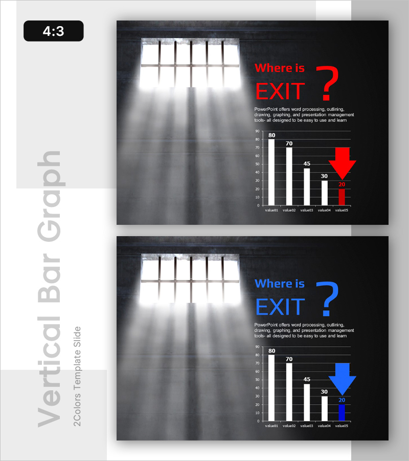
A PowerPoint slide designed for visualizing business risk analysis and failure factors. The slide features a black background with white and red bar charts that clearly display a five-stage data decline trend. It includes a title area, descriptive text, and an emphasis arrow to highlight key points in business performance deterioration presentations. The 2-slide set provides identical layouts in red and blue color variations, making it ideal for comparative analysis and scenario-based presentations. Available in 4:3 ratio PPTX format for immediate editing and customization.
Usage Points
-
Main Usage
This slide quantitatively analyzes and explains negative trends such as business performance decline, market share loss, and competitive weakness. It supports data-driven decision-making during risk identification, failure cause analysis, and improvement strategy development phases.
-
How to Use
Use this slide in investor relations materials, business reports, and executive briefings when explaining negative performance or risk indicators. Input specific metrics (revenue, market share, satisfaction scores) into each bar and emphasize key decline points with arrows to focus audience attention.
-
Recommended For
Executives, investors, board reporting officers, business analysis teams, consultants, and marketing strategists explaining risk analysis and performance decline causes. Particularly effective for quarterly performance reviews and business restructuring plan presentations.
-
Slide Structure
Composed of a title area (Where is EXIT?), descriptive text box (PowerPoint feature explanation), a five-value bar chart (80→70→45→30→20), and one emphasis arrow. The balanced ratio between text and chart ensures both data readability and explanation space.


