Carbon Neutral Customer Survey Pie Chart
RJ0600018_8
- Last Update 06/25/2025
- File Size 0.5MB
- # of Slides 2
- File Format PPTX
- Slide Ratio 16:9
- Color
Keywords
- #Content-Based Slides
- #Design-Based Slides
- #Market and Competitor Analysis
- #Graph
- #Market Status
- #Market Share
- #Circles
- #Pie Chart
- #16:9
- #pie chart PowerPoint slide
- #pie graph presentation template
- #ratio data visualization
- #customer survey chart
- #market share pie chart
- #data representation slide download
About the Product
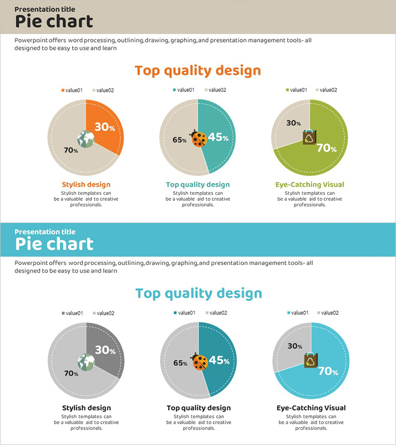
A PowerPoint pie chart slide optimized for customer survey results and market analysis presentations. The 2-slide set features dual-segment pie charts in three color variations: orange, teal, and lime on the first slide, with gray and teal tones on the second. Each segment displays percentage values and icons to convey data meaning intuitively. Provided in 16:9 widescreen PPTX format with fully editable text and numerical values, making it ideal for visualizing ratio data such as carbon neutrality achievement, customer satisfaction, and market share across various business contexts.
Usage Points
-
Main Usage
Visualize two-part ratio data such as customer survey results, market share percentages, or carbon neutrality targets using pie chart format. Each segment includes percentage values and icons to enable instant data comprehension during presentations.
-
How to Use
Insert into market analysis, customer insights, or performance report sections of business presentations. Customize text, numerical values, and colors to match your specific data and presentation style. Choose between two color scheme variations to align with your corporate branding.
-
Recommended For
Recommended for marketing professionals, business planners, sales teams, and executives preparing business plans, proposals, investment pitches, marketing strategies, and performance reports requiring ratio-based data visualization.
-
Slide Structure
2-slide layout. Slide 1: Three pie charts with orange (30%) / gray (70%), teal (45%) / gray (65%), and lime (30%) / gray (70%) segments, each with percentage labels, icons, and legend. Slide 2: Identical structure in gray and teal color scheme. All text and values are editable.
Related Products
-

Two Pie Charts with Commentary – Market Share Analysis
#Market and Competitor Analysis #Graph #Market Status
-

Yellow Marketing Pie Chart – Market Share Analysis
#Market and Competitor Analysis #Graph #Market Status
-

Pie Chart for Oriental Medicines Market Overview
#Market and Competitor Analysis #Graph #Market Status
-

Pie Chart for Market Share Analysis – Data Visualization
#Market and Competitor Analysis #Graph #Market Status
