Numerical Comparison Illustration Chart – Visual Storytelling
RJ0600010_17
- Last Update 06/23/2025
- File Size 1.1MB
- # of Slides 2
- File Format PPTX
- Slide Ratio 16:9
- Color
Keywords
About the Product
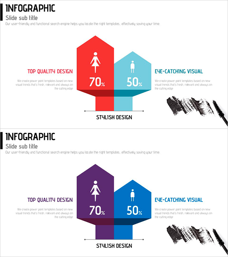
A PowerPoint slide set that visualizes numerical comparisons across demographics, age groups, or categories using hexagon diagrams. Features contrasting color schemes (red-light blue and purple-navy blue) with centered icons to maximize visual emphasis and clearly display percentage data. The 2-slide set offers two color combinations, allowing you to select the palette that best matches your presentation theme and brand identity. Fully editable and ready to use in marketing presentations, market research reports, and performance summaries for demographic data visualization and customer preference analysis.
Usage Points
-
Main Usage
Visualizes numerical comparisons across demographics, age groups, or categories using hexagon diagrams to clearly convey data contrasts. Percentage figures and centered icons enable intuitive recognition of comparison subjects while ensuring both credibility and readability in your presentation.
-
How to Use
Apply in marketing strategy presentations for target audience analysis, market research reports for demographic comparisons, performance reports for gender and age-based metrics, and sales presentations for regional or product-line comparisons. Edit the hexagon shapes and numerical values to match your data, and select the color combination that aligns with your presentation theme.
-
Recommended For
Ideal for marketing teams analyzing customer segmentation, HR departments comparing workforce composition, sales teams presenting regional or product performance, and executive presentations requiring data-driven decision-making. Suitable for any business presentation where comparative metrics are essential.
-
Slide Structure
2-slide set with identical layouts featuring different color schemes. Each slide displays two hexagon nodes (left and right) connected by a central vertical bar. Each hexagon contains an icon and percentage value (70%, 50%, etc.), with editable text areas on both sides for labels. Color options: red-light blue and purple-navy blue combinations.
Related Products
-

Strategic Business Table – Business Vision and Marketing Strategy
#Business Vision and Strategy #Marketing Plan and Strategy #Diagram
-

Internet Security Platform Structure Diagram – Stability and Innovation
#Business Strategy #Technical Approach #Diagram
-

Diagram for Network Firewall Service Promotion and Implementation Plan
#Business Management #Diagram #Execution Plan
-

Competitor Positioning Graph – Diagram for Market Analysis
#Market and Competitor Analysis #Marketing Plan and Strategy #Diagram
