Education Data Analysis Chart – Stylish Donut Chart for Business Introduction
RJ0500041_10
- Last Update 06/18/2025
- File Size 0.5MB
- # of Slides 2
- File Format PPTX
- Slide Ratio 16:9
- Color
Keywords
- #Content-Based Slides
- #Design-Based Slides
- #Business Introduction
- #Diagram
- #Graph
- #Business Overview
- #Technological Status
- #Spread
- #Circles
- #Centralized Diagram
- #Doughnut Chart
- #16:9
- #donut chart PowerPoint
- #pie chart slide template
- #data ratio visualization
- #3-segment donut graph
- #business data presentation slide
About the Product
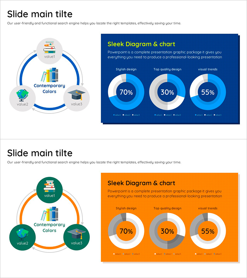
A professional donut chart PowerPoint slide optimized for educational and business data analysis presentations. Three independent donut graphs display 70%, 30%, and 55% ratios respectively, set against a dark blue background with white and light blue gradient styling. Each chart includes a legend area below for clear data labeling. The 2-slide set is formatted in 16:9 widescreen ratio, ready for immediate use in modern presentation environments. This PowerPoint slide template effectively visualizes numerical data and is ideal for business reports, educational statistics, and comparative analysis presentations.
Usage Points
-
Main Usage
Designed to compare and display ratio data across three categories simultaneously, such as educational statistics, business performance metrics, and market research findings. Each donut chart functions independently, allowing clear visualization of different categorical compositions without visual overlap.
-
How to Use
Deploy this slide in business introductions, marketing strategy presentations, and educational data analysis sections to emphasize key metrics. Simply edit the percentage values and legend labels with your own data; the dark blue background provides an immediate professional appearance suitable for corporate and academic contexts.
-
Recommended For
Ideal for educational institutions presenting student performance analytics, corporations delivering quarterly performance reports, marketing teams measuring campaign effectiveness, and consulting firms preparing client proposals. Recommended for any presentation requiring data-driven decision-making visualization.
-
Slide Structure
Two-slide set featuring a left-side circular diagram with three nodes (labeled Contemporary Colors with value1, value2, value3) and a right-side dark blue background with three donut charts (70%, 30%, 55% respectively) and legend areas. The second slide mirrors this layout with an orange background, providing color variation options for visual flexibility.
Related Products
-

Visualizing Military Data with Donut Chart – Power of Trust
#Product/Service Introduction #Business Introduction #Diagram
-

Cat Donut Chart – Data Analysis and Creativity
#Product/Service Introduction #Business Introduction #Diagram
-

Transforming Business Operations with SaaS Integration – Discover More
#Product/Service Introduction #Business Introduction #Diagram
-

Tool Diffusion Diagram Centered – Business Overview and Technology Status
#Business Introduction #Diagram #Business Overview
