Local Signs and Academic Messages – Effective Information Delivery
RJ0500025_29
- Last Update 06/13/2025
- File Size 0.7MB
- # of Slides 2
- File Format PPTX
- Slide Ratio 16:9
- Color
Keywords
- #Content-Based Slides
- #Design-Based Slides
- #Market and Competitor Analysis
- #Diagram
- #Other
- #Target Market
- #Cluster
- #Combination Diagram
- #16:9
- #world map PowerPoint slide
- #regional data visualization
- #cluster diagram template
- #global network presentation
- #geographic data PPT
- #map slide design download
About the Product
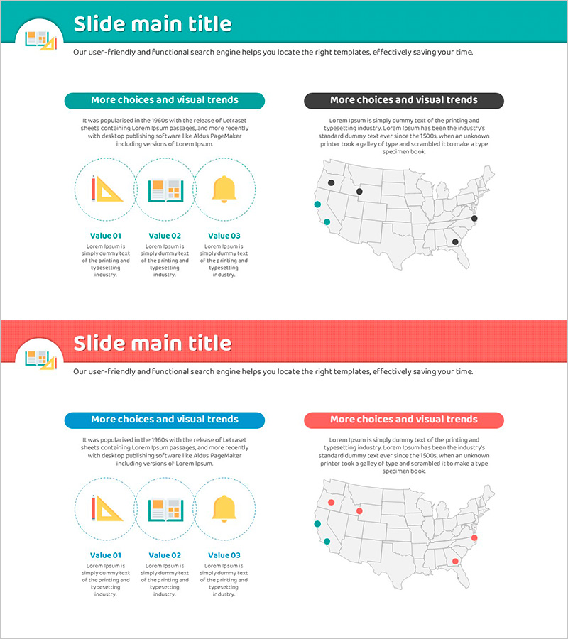
A world map cluster diagram PowerPoint slide set for visualizing regional data distribution and academic messaging. Features a teal header with white background in minimalist layout, displaying three icon areas on the left and multiple data points on the world map on the right for instant regional comparison. Two color-coded tabs (teal and charcoal) present dual data scenarios, while Value 01–03 text boxes below allow detailed regional descriptions. Delivered in 16:9 widescreen PPTX format with 2 slides, ready for market analysis presentations, global network introductions, regional performance reports, and international business communications.
Usage Points
-
Main Usage
Visualize global distribution, regional performance, and international networks by displaying data points as clusters on a world map. Dual-tab design (teal and charcoal) enables side-by-side scenario comparison, while the balanced left-icon and right-map layout maximizes information clarity and audience engagement.
-
How to Use
Input key metrics or categories in the three left-side icon areas, then adjust map point colors and positions to match your regional data. Fill in the Value 01–03 text boxes with region-specific details, figures, and achievements to complete the comparative analysis. Use the teal and charcoal tabs to separate scenario-based slides during presentation.
-
Recommended For
Global business strategy presentations, international market analysis reports, regional sales performance reviews, overseas branch introductions, international partnership network explanations, and multinational project status updates. Ideal for executives, marketing teams, and sales teams presenting region-by-region data comparisons.
-
Slide Structure
2-slide set. Each slide features a teal or charcoal header tab at top, three circular icon areas (Value 01–03 labels) on the left, and a world map with 5–7 clustered data points on the right. Points are color-coded in teal, charcoal, and gray to represent regional categories.
Related Products
-

Analysis of the US Startup Market – Strategic Goals and Complex Insights
#Market and Competitor Analysis #Marketing Plan and Strategy #Diagram
-

Target Market Goal Setting and Analysis – Visual Data Cluster
#Market and Competitor Analysis #Diagram #Other
-

Infographic Slide for Regional Data Visualization
#Market and Competitor Analysis #Marketing Plan and Strategy #Graph
-

Visualizing Country Design Preferences with Rectangle Diagrams
#Market and Competitor Analysis #Marketing Plan and Strategy #Graph
