Scientific Data Analysis Area Diagram - Key Components of Data Science
RJ0400059_10
- Last Update 06/02/2025
- File Size 0.9MB
- # of Slides 2
- File Format PPTX
- Slide Ratio 16:9
- Color
Keywords
- #Content-Based Slides
- #Design-Based Slides
- #Company Introduction
- #Technical Approach
- #Diagram
- #Business Areas
- #System Architecture Diagram
- #Spread
- #Centralized Diagram
- #16:9
- #radial diagram PowerPoint
- #data science presentation slide
- #central node diagram
- #technology architecture PPT
- #data analysis PowerPoint template
About the Product
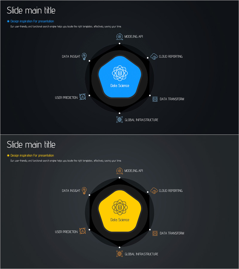
A PowerPoint slide visualizing the core components of data science through a central pentagon node and 8 radial icons arranged in a circular pattern. Set against a dark background with a blue or yellow central node, the diagram displays key areas including data insight, cloud reporting, modeling API, data transform, global infrastructure, user prediction, and more using icons and text labels. The 2-slide set provides color variations (blue and yellow versions), making it immediately applicable for technology presentations, IT strategy discussions, and data analytics briefings.
Usage Points
-
Main Usage
Designed to present the core components of a data science project in a single, comprehensive view by radiating from a central node to 8 surrounding areas. Clearly communicates team roles, responsibilities, and interconnections, making it ideal for technology strategy presentations, data governance discussions, and technical architecture briefings where complex systems need to be explained simply.
-
How to Use
Enter your core concept (Data Science, AI, Platform, etc.) in the central pentagon node, then add specific functions, modules, or team roles to the 8 radial areas. Customize the icons and text labels to match your project structure, and select either the blue or yellow color version to align with your brand identity. All elements are fully editable.
-
Recommended For
Data scientists, AI engineers, technical leaders, IT strategy managers, CTOs, and data governance professionals explaining technical structures, system architectures, and project components. Suitable for technology conferences, internal technical workshops, investor presentations, and technical proposals where complex data ecosystems need visual communication.
-
Slide Structure
2-slide set featuring the same radial diagram in two color variations: blue central node version and yellow central node version. Each slide contains 1 central pentagon node with 8 radial icons positioned at cardinal and intercardinal directions (top, top-right, right, bottom-right, bottom, bottom-left, left, top-left), with editable text label areas next to each icon.
Related Products
-

Business Ideas Area Circular Diagram
#Company Introduction #Business Introduction #Diagram
-

Business Gradient Diagram – Visualizing Business Areas and Fields
#Company Introduction #Business Introduction #Diagram
-

Energy Business Area – Business Introduction Diagram
#Company Introduction #Business Introduction #Diagram
-

Financial Business Area Circular Diagram – Effective Visualization for Business Introduction
#Company Introduction #Business Introduction #Diagram
