Comparison of Sugar Intake by Year – Data Analysis and Visualization
RJ0400034_5
- Last Update 05/26/2025
- File Size 2.7MB
- # of Slides 2
- File Format PPTX
- Slide Ratio 16:9
- Color
Keywords
About the Product
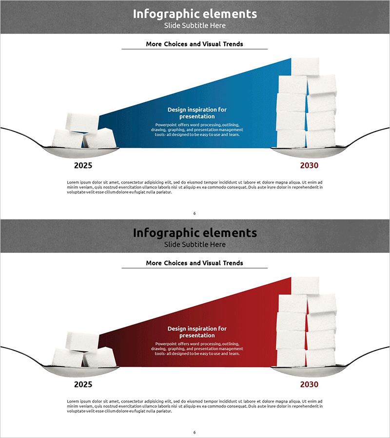
A timeline-based infographic PowerPoint slide designed for year-over-year data comparison. This presentation template visualizes information across two time points (2025 and 2030) using a diagonal composition with 3D grayscale elements on the left and a prominent accent color (blue or red) on the right. The layout combines text descriptions with data points and trend insights for immediate comprehension. Ideal for business updates, market analysis, performance reports, and strategic presentations. Both slides feature editable text areas, customizable color schemes, and a professional layout suitable for corporate and analytical contexts.
Usage Points
-
Main Usage
This slide effectively compares data across two time periods or tracks changes over time. Perfect for presenting business performance, market trends, customer satisfaction metrics, revenue growth, or any metric requiring period-to-period comparison. The diagonal layout and color contrast emphasize directional change and magnitude of difference.
-
How to Use
Enter baseline period data (e.g., 2025) on the left side and comparison period data (e.g., 2030) on the right. Insert key insights or percentage change in the central accent area. Add detailed analysis or interpretation in the bottom text section. Customize colors (blue, red, green) based on category or positive/negative connotation. All text fields are fully editable.
-
Recommended For
Recommended for business status reports, market analysis presentations, performance evaluations, investor briefings, and executive summaries. Particularly effective for presenting year-over-year growth rates, market share changes, customer satisfaction trends, and financial metric comparisons. Ideal for consulting, finance, manufacturing, and retail sectors where data-driven decision-making is critical.
-
Slide Structure
Two-slide set with three-column layout: left section for baseline period/reference point, center section with accent color block and key message, right section for comparison period. Each slide includes title and subtitle areas at top, 3D visual elements and color-coded emphasis block in center, and detailed description text area at bottom.
Related Products
-

Business Expected Effects Area Diagram – Profitability and Expectations
#Business Introduction #Business Strategy #Diagram
-

Legal Education Main Areas of Activity – Diagram for Business Development
#Business Introduction #Business Vision and Strategy #Diagram
-

AI sLLM Core Strategy PowerPoint Slide – Venn Diagram Layout
#Product/Service Introduction #Business Introduction #Business Vision and Strategy
-

Promotional Strategy Triangle Overlay Diagram
#Company Introduction #Business Introduction #Diagram
