Genetically Modified Corn Analysis Circle Graph – Showcasing Competitive Advantage
RJ0400031_17
- Last Update 05/26/2025
- File Size 8MB
- # of Slides 2
- File Format PPTX
- Slide Ratio 16:9
- Color
Keywords
About the Product
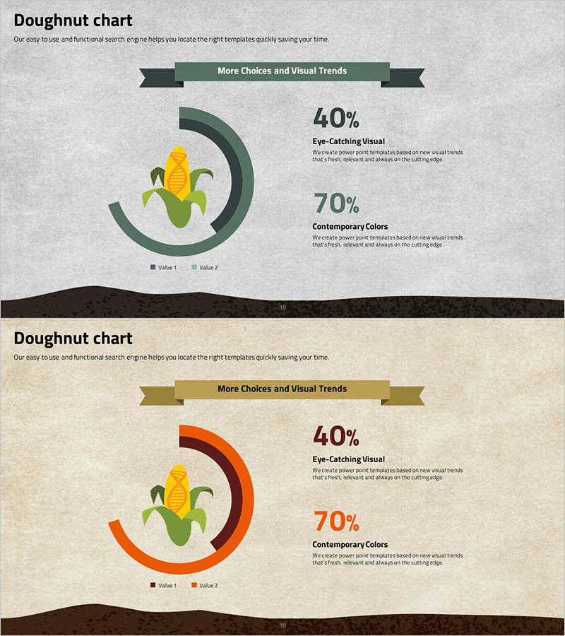
A PowerPoint slide template featuring a two-segment donut chart that intuitively displays data ratios in circular form. Two design variations are provided: one with dark green tones and another with orange tones. Each slide includes a visual icon (corn illustration) paired with prominent numerical labels such as 40% and 70%, positioned alongside descriptive text areas. This presentation slide is ideal for business communications requiring clear data composition display, including market share analysis, competitive advantage assessment, and product mix comparison. Delivered in 16:9 widescreen format with 2 slides, fully editable and ready to customize.
Usage Points
-
Main Usage
Visualizes the proportional relationship between parts and the whole using circular chart design. Effectively communicates business data such as market share, product composition ratios, and competitive positioning. The combination of icons and text labels enhances presentation impact and audience comprehension.
-
How to Use
Open the slide and modify the donut chart colors and percentages to match your data. Update the text boxes with your own percentage values and descriptions, and replace the icon with alternative imagery if needed to align with your presentation topic.
-
Recommended For
Recommended for marketing professionals, sales strategy teams, financial analysts, and executives preparing business reports. Ideal for presentations covering market analysis, product portfolio composition, customer segmentation, and revenue mix breakdown.
-
Slide Structure
Two-slide layout with one donut chart per slide. First slide features dark green color scheme; second slide uses orange tones. Each chart is divided into 2 segments with corresponding percentage labels (40%, 70%, etc.) and descriptive text positioned to the right of the chart.
Related Products
-

Sharing vs Housing Insights Chart – Market Share and Competitive Advantage
#Market and Competitor Analysis #Graph #Market Share
-

Earth Analysis Donut Circle Graph – Enhancing Market Competitiveness
#Market and Competitor Analysis #Graph #Competitor Analysis
-

Competitive Advantage Donut Pie Chart (3 colors) – Frontline of Market Analysis
#Market and Competitor Analysis #Graph #Competitor Analysis
-

Market Analysis and Competitive Advantage Graph – The Power of Data Visualization
#Market and Competitor Analysis #Graph #Market Analysis
