Market Status and Share Analysis Slide – The Harmony of Blue and Orange
RJ0400021_8
- Last Update 05/23/2025
- File Size 1.4MB
- # of Slides 2
- File Format PPTX
- Slide Ratio 16:9
- Color
Keywords
About the Product
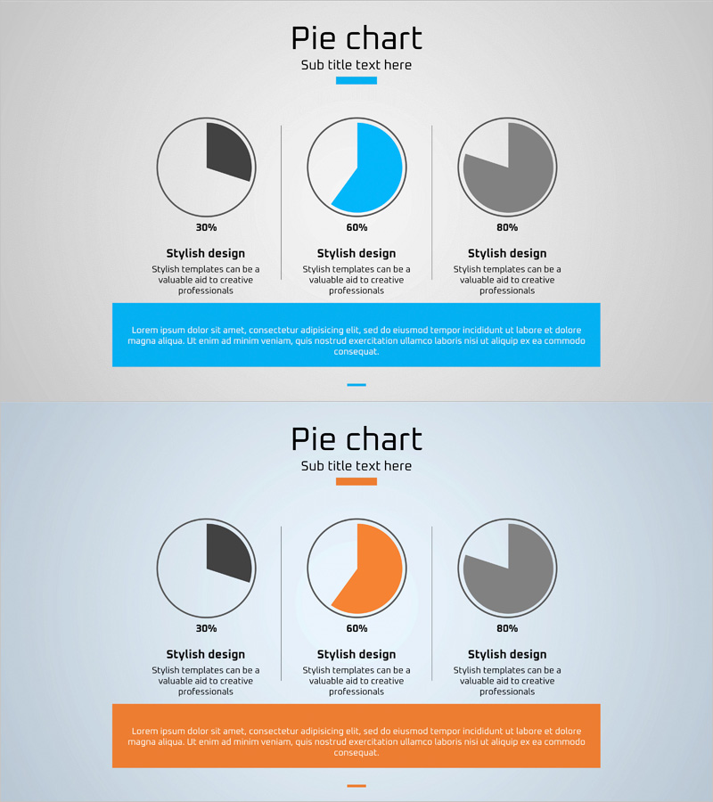
A professional pie chart PowerPoint slide designed to visualize market status and share distribution at a glance. The slide features three circular pie charts displaying 30%, 60%, and 80% proportions respectively. Blue, orange, and gray color segments provide clear data differentiation, with descriptive text areas beneath each chart for easy customization. A prominent colored box at the bottom—blue or orange depending on the slide—allows you to insert key messages or insights. This versatile PowerPoint slide is ideal for executive reports, marketing analysis presentations, business proposals, and competitive landscape reviews.
Usage Points
-
Main Usage
Display and compare multiple ratio datasets simultaneously using three pie charts, enabling side-by-side market share, competitive positioning, or customer segment analysis. Editable percentages and labels allow real-time data integration, while the bottom accent box highlights key insights and conclusions.
-
How to Use
Apply in executive summary sections of business reports, competitive analysis slides in marketing decks, market opportunity explanations in investor pitch decks, and customer segmentation analysis in business proposals. Customize pie segment colors and percentages to represent different data combinations and scenarios.
-
Recommended For
Marketing managers, business analysts, strategy consultants, financial analysts, and product managers who need to communicate multi-dimensional ratio data visually. Particularly effective for presentations requiring comparative analysis of market segments or performance metrics.
-
Slide Structure
Two-slide set with three horizontally arranged pie charts per slide. Each chart includes percentage labels and descriptive text fields below for customization. First slide features a blue accent box at the bottom; second slide uses an orange accent box for visual variety and emphasis.
Related Products
-

Two Pie Charts with Commentary – Market Share Analysis
#Market and Competitor Analysis #Graph #Market Status
-

Pie Chart for Oriental Medicines Market Overview
#Market and Competitor Analysis #Graph #Market Status
-

Pie Chart for Market Share Analysis – Data Visualization
#Market and Competitor Analysis #Graph #Market Status
-

Market Targets and Status Chart – Visually Appealing Insights
#Market and Competitor Analysis #Graph #Market Status
