Market Status and Share Graph – Harmony of Blue and Orange
RJ0400021_31
- Last Update 05/23/2025
- File Size 1.4MB
- # of Slides 2
- File Format PPTX
- Slide Ratio 16:9
- Color
Keywords
About the Product
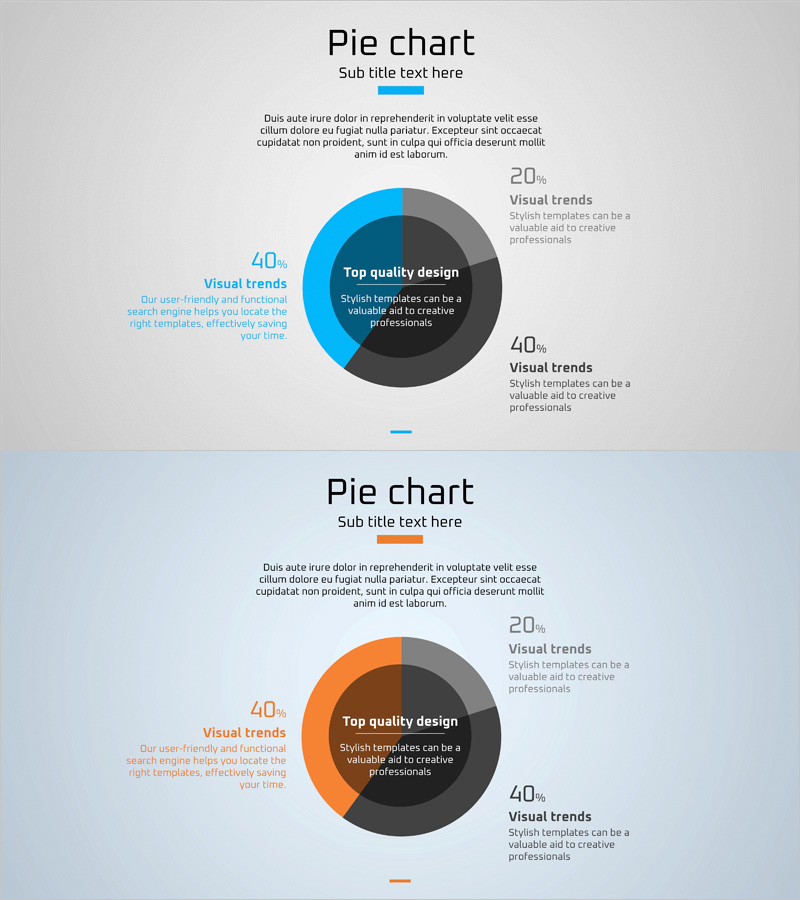
A professional pie chart PowerPoint slide designed to visualize market status and share distribution across four segments. The slide features a color-coded design with blue, orange, and gray tones to clearly distinguish each data category, accompanied by percentage values and descriptive labels for easy interpretation. The two-slide set provides identical layouts with variations, allowing you to present multiple market metrics simultaneously. Delivered in 16:9 widescreen PPTX format with fully editable elements, this slide template is ideal for business presentations, marketing strategy documents, market analysis reports, and competitive positioning discussions.
Usage Points
-
Main Usage
Effectively communicate market share distribution, competitor comparison, customer segmentation, revenue breakdown, and other ratio-based data through a clear, visually organized pie chart format. Percentage values and segment labels ensure accurate data representation and audience comprehension.
-
How to Use
Incorporate this slide into market analysis sections of marketing plans, performance review pages in business reports, market size explanations in investor pitch decks, and customer demographic presentations. Simply edit the segment colors, percentages, and labels to match your specific data and business context.
-
Recommended For
Marketing managers, business strategists, sales executives, financial analysts, management consultants, and business development professionals who need to present market data compellingly. Particularly effective for executive briefings, client presentations, strategic planning meetings, and competitive analysis discussions.
-
Slide Structure
Each slide contains a title and subtitle area at the top, with a centered 4-segment pie chart as the focal point. Chart segments are color-differentiated (blue 40%, orange 40%, gray 20% as example), with percentage values and explanatory text positioned on both sides. Both slides maintain consistent layout for cohesive presentation flow.
Related Products
-

Travel Survey Results – Market Share Visualization
#Market and Competitor Analysis #Graph #Market Status
-

City and Nature Pie Chart Statistics – Visualization of Market Status
#Market and Competitor Analysis #Graph #Market Status
-

Pie Chart for Oriental Medicines Market Overview
#Market and Competitor Analysis #Graph #Market Status
-

Pie Chart Slide Visualizing Transportation Status
#Market and Competitor Analysis #Graph #Market Status
