Scientific History Connection Diagram – Visualizing the Flow of Information
RJ0400019_4
- Last Update 05/22/2025
- File Size 0.4MB
- # of Slides 2
- File Format PPTX
- Slide Ratio 16:9
- Color
Keywords
About the Product
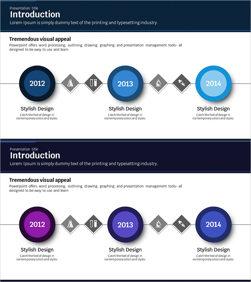
A 3-stage connection diagram PowerPoint slide designed to visualize scientific history, information flow, and sequential relationships. Features circular nodes with blue-to-light-blue gradient coloring and diamond-shaped connector elements that clearly express temporal progression and cause-effect relationships. The 2-slide set includes a color variation (blue and purple tones) allowing you to select the best fit for your presentation context. Ideal for scientific history, technology development stages, project milestones, organizational evolution, and any presentation requiring linear connection visualization.
Usage Points
-
Main Usage
Optimized for visualizing scientific history, technology development phases, project progression, and organizational evolution through 3-stage linear connections. Input years, events, or milestones in each node's central text area to clearly communicate temporal flow and progression.
-
How to Use
Enter years or key events in the central text area of each circular node, and add detailed descriptions in the text boxes below. Enhance stage relationships by adding icons to the diamond connector elements. Use the color-variant slide to create visual contrast and emphasis between sections.
-
Recommended For
Recommended for scientific and technology presentations, company history introductions, product development roadmaps, project milestone reports, and organizational growth narratives. Suitable for academic presentations, technical seminars, executive briefings, and educational materials.
-
Slide Structure
2-slide set. Each slide contains 3 circular nodes (dark blue to light blue gradient), 2 diamond connector elements, and 3 descriptive text boxes at the bottom. First slide features blue tones; second slide provides purple tone variation for visual flexibility.
Related Products
-

Business History Connection Diagram
#Company Introduction #Diagram #History
-

Fountain Pen History Diagram – Emphasizing Corporate Identity
#Company Introduction #Product/Service Introduction #Diagram
-

History Road Diagram – A Cluster Diagram Ideal for Company Introduction
#Company Introduction #Diagram #History
-

History Folder Shape Diagram - Optimized for Company Introduction
#Company Introduction #Product/Service Introduction #Diagram
