Medical Business Sector Overlap Diagram - Business Integration Strategy
RJ0400012_12
- Last Update 05/20/2025
- File Size 1.7MB
- # of Slides 2
- File Format PPTX
- Slide Ratio 16:9
- Color
Keywords
- #Content-Based Slides
- #Design-Based Slides
- #Company Introduction
- #Product/Service Introduction
- #Diagram
- #Business Areas
- #Features
- #Cluster
- #Combination Diagram
- #16:9
- #overlap diagram PowerPoint
- #3-area Venn diagram slide
- #business integration strategy presentation
- #intersection diagram template
- #cross-functional relationship slide
About the Product
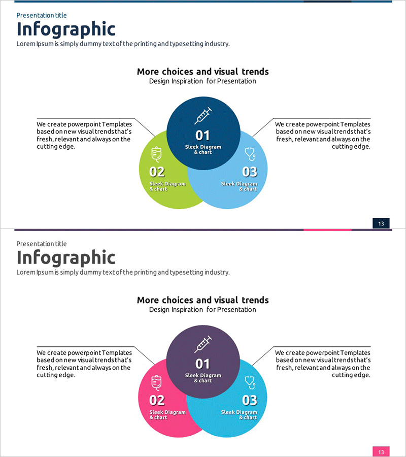
A three-area overlap diagram PowerPoint slide that visualizes intersections between business domains, departments, or strategies. The design uses dark blue, lime green, and sky blue to distinguish each area, with the central intersection zone ideal for highlighting core messages and shared objectives. This presentation slide is optimized for expressing business field integration, strategic alignment, and cross-functional relationships. The 2-slide set is ready to use immediately, with fully editable text, icons, and color customization to match your organization's branding.
Usage Points
-
Main Usage
Visually represents intersections and integration points between three or more business domains, departments, or strategic initiatives. Effectively communicates cross-functional relationships, collaboration frameworks, and synergies across healthcare, technology, and business sectors. Ideal for executive presentations, strategic alignment discussions, and organizational restructuring announcements.
-
How to Use
Enter department names, business domains, or strategic pillars in each circular area, and place integration goals, shared values, or combined outcomes in the central intersection zone. Customize icons and text colors to match your corporate branding, then insert into presentations, reports, or strategic planning documents.
-
Recommended For
Recommended for executives, strategy teams, business development managers, marketing professionals, and organizational development specialists explaining cross-organizational collaboration and business integration. Suitable for companies with multiple business units in healthcare, IT, finance, and manufacturing presenting at board meetings, investor relations events, and internal training sessions.
-
Slide Structure
Two-slide set featuring a three-circle Venn diagram layout. Slide 1 uses dark blue, lime green, and sky blue; Slide 2 features dark purple, hot pink, and sky blue for design variety. Each area and intersection zone includes editable text and icon placeholders, allowing full customization for different presentation contexts and data sets.
Related Products
-

Plastic Surgery Business Sector Diagram – Innovation and Aesthetic Harmony
#Company Introduction #Product/Service Introduction #Diagram
-

Business Area Diagram – Emphasizing Business Characteristics
#Company Introduction #Product/Service Introduction #Diagram
-

Entertainment Business Area Diagram – Dynamics of Business
#Company Introduction #Business Introduction #Diagram
-

Business Area Circular Nesting Diagram – Cluster Visualization
#Company Introduction #Business Introduction #Diagram
