Data Insights Enhanced by Highlighted Metrics
RJ0300099_5
- Last Update 05/17/2025
- File Size 0.1MB
- # of Slides 2
- File Format PPTX
- Slide Ratio 16:9
- Color
Keywords
About the Product
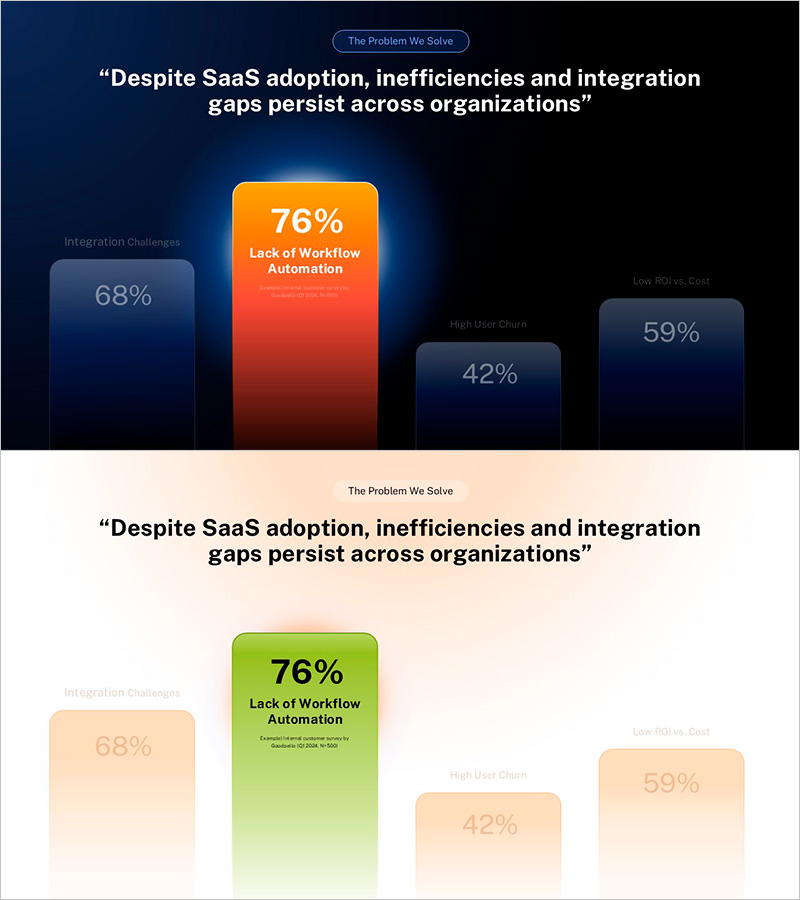
A data-driven PowerPoint slide that visualizes SaaS adoption challenges and organizational pain points through highlighted metrics. Set against a dark blue background, the slide features orange and red accent bars that emphasize key performance indicators: 76% workflow automation gaps, 68% integration challenges, 42% high user churn, and 59% low ROI versus cost. This 2-slide deck is ready for market analysis presentations, competitive benchmarking, and investment decision-making. The layout prioritizes numerical comparison to strengthen persuasive messaging in business reports and strategic planning sessions.
Usage Points
-
Main Usage
Communicate market insights, competitive analysis, and organizational challenges through data-driven bar charts with emphasized metrics. This slide is designed for investment pitches, executive briefings, and strategic planning sessions where numerical comparison drives decision-making and stakeholder alignment.
-
How to Use
Replace the text labels with your market analysis categories or organizational metrics. Update the bar chart percentages with actual data from your research or internal reports. Use the orange and red accent colors to highlight the most critical findings, and adjust the left-side labels and right-side values to match your presentation context.
-
Recommended For
Business analysts, strategy managers, investment professionals, and C-suite executives who need to present data-backed insights. Ideal for quarterly business reviews, investor relations presentations, market entry strategies, and competitive positioning reports where metric comparison is essential.
-
Slide Structure
Two-slide layout with title and descriptive text area paired with four comparative bars displaying percentage metrics. Each bar is color-coded by priority level, with editable labels on the left and numerical values on the right. The design supports easy customization for different data sets while maintaining visual hierarchy and readability.
Related Products
-

Residential Lighting Graph – Market Analysis
#Market and Competitor Analysis #Graph #Other
-

Triangular Pattern Presentation Template Area Chart – Market Analysis and Competitive Edge
#Market and Competitor Analysis #Graph #Other
-

Graph Slide Highlighting the Importance of Drinking Water - Market Analysis
#Market and Competitor Analysis #Graph #Other
-

Wedding Preparation Progress Scale Slide – Visualization of Market Status
#Market and Competitor Analysis #Graph #Other
