Competitor Analysis Bar Graph – Visualizing Market Competitive Advantages
RJ0300044_10
- Last Update 04/29/2025
- File Size 0.2MB
- # of Slides 2
- File Format PPTX
- Slide Ratio 16:9
- Color
Keywords
- #Content-Based Slides
- #Design-Based Slides
- #Market and Competitor Analysis
- #Graph
- #Competitor Analysis
- #Competitive Advantage
- #Column
- #Column Chart
- #16:9
- #competitor analysis bar chart
- #market competition analysis PowerPoint
- #horizontal bar graph slide
- #vertical bar chart template
- #data comparison visualization
About the Product
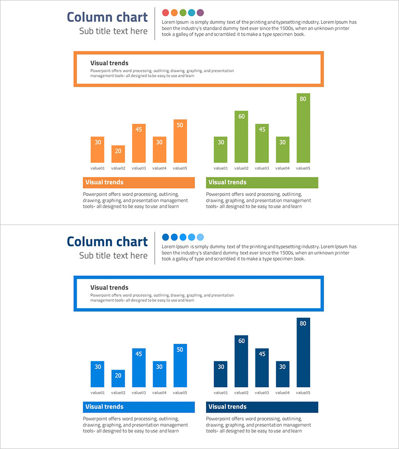
A horizontal and vertical bar chart PowerPoint slide designed for competitor analysis and market competitive advantage visualization. The dual-series design uses orange and green colors to compare 5 data points in each group, enabling clear side-by-side performance comparison. Each bar displays numeric labels for precise value communication, and a description text box at the bottom allows you to add strategic insights. This presentation template is ready to use in business strategy presentations, market analysis reports, and executive briefings.
Usage Points
-
Main Usage
This slide compares quantitative data such as competitor performance, capabilities, and market share across two groups. Bar height intuitively represents numerical differences, while color differentiation emphasizes group contrast. It effectively communicates competitive positioning in executive reports, investor pitches, and strategy meetings.
-
How to Use
Replace bar values with your company and competitor data, then update legend and axis labels with relevant metric names. Add analysis findings or strategic implications in the bottom text box to support data interpretation. Colors can be adjusted to match corporate branding, and the 2-slide format allows you to present multiple analysis dimensions.
-
Recommended For
Strategy planners, marketing teams, executive report managers, consultants, and business development professionals creating competitive analysis materials. Suitable for market research reports, business plans, investor pitch decks, quarterly business reviews, and strategic planning presentations.
-
Slide Structure
2-slide format. Each slide contains a title area, dual-series bar chart with 5 orange bars (value1–5) and 5 green bars (value1–5) in horizontal and vertical layouts, and a description text box at the bottom. Numeric labels appear on each bar, with legend and axis labels clarifying data meaning.
Related Products
-

Comparative Analysis 3D Cylinder Bar Graph – Market and Competitor Analysis
#Market and Competitor Analysis #Graph #Competitor Analysis
-

Competitor Analysis Bar Graph – Enhancing Market Insights
#Market and Competitor Analysis #Graph #Competitor Analysis
-

Competitor Analysis Bar Graph - Visualizing Market Status
#Market and Competitor Analysis #Graph #Competitor Analysis
-

Dual Column Chart by Quarter – Market Analysis and Competitive Advantage
#Market and Competitor Analysis #Graph #Competitor Analysis
