Company Introduction
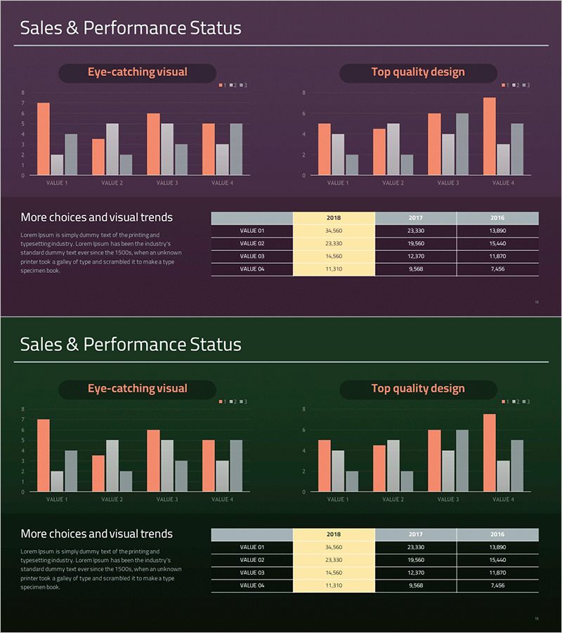
Year-by-Year Comparison Analysis Bundle Graph – Visualizing Market Performance
RM0300020_17
- Last Update 12/21/2025
- File Size 0.3MB
- # of Slides 2
- File Format PPTX
- Slide Ratio 16:9
- Color
Keywords
About the Product
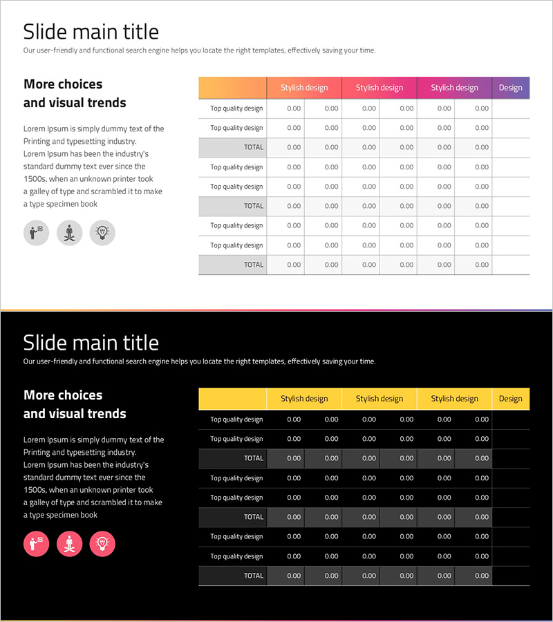
This slide visually presents yearly performance using a bundle graph, allowing easy identification of trends and changes. Its intuitive design and modern color combination (purple and green) make it ideal for comparing and analyzing performance over years. It contributes to delivering a clear and impactful message in presentations related to company introduction and market analysis. Users can conveniently digest complex data through this slide, and the editing difficulty is rated as 'moderate', making it easily adaptable for various users.
Related Products
-
Visually Appealing Company Introduction PowerPoint Template
#Company Introduction #Product/Service #Business Vision and Strategy
-
Construction Business Company Overview – Capturing Business Achievements
#Company Introduction #Business Introduction #Diagram
-
Writing Instrument Icon Horizontal Bar Chart – Market and Technology Overview
#Business Introduction #Market and Competitor Analysis #Graph
-
Social Network Wide Template Table – Financial Planning and Results
#Financial Plans and Performance #Diagram #Capital Requirement Plan
