Market and Competitor Analysis
Usage Analysis Graph – Visualizing Market Status
RJ0900021_18
- Last Update 12/21/2025
- File Size 0.2MB
- # of Slides 2
- File Format PPTX
- Slide Ratio 16:9
- Color
Keywords
About the Product
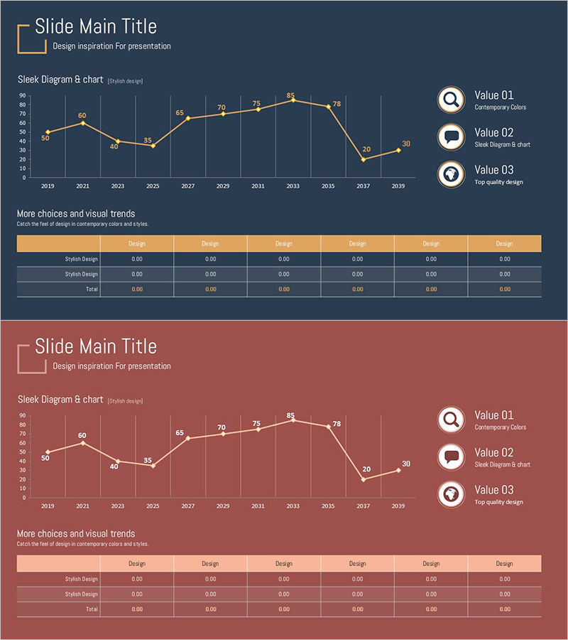
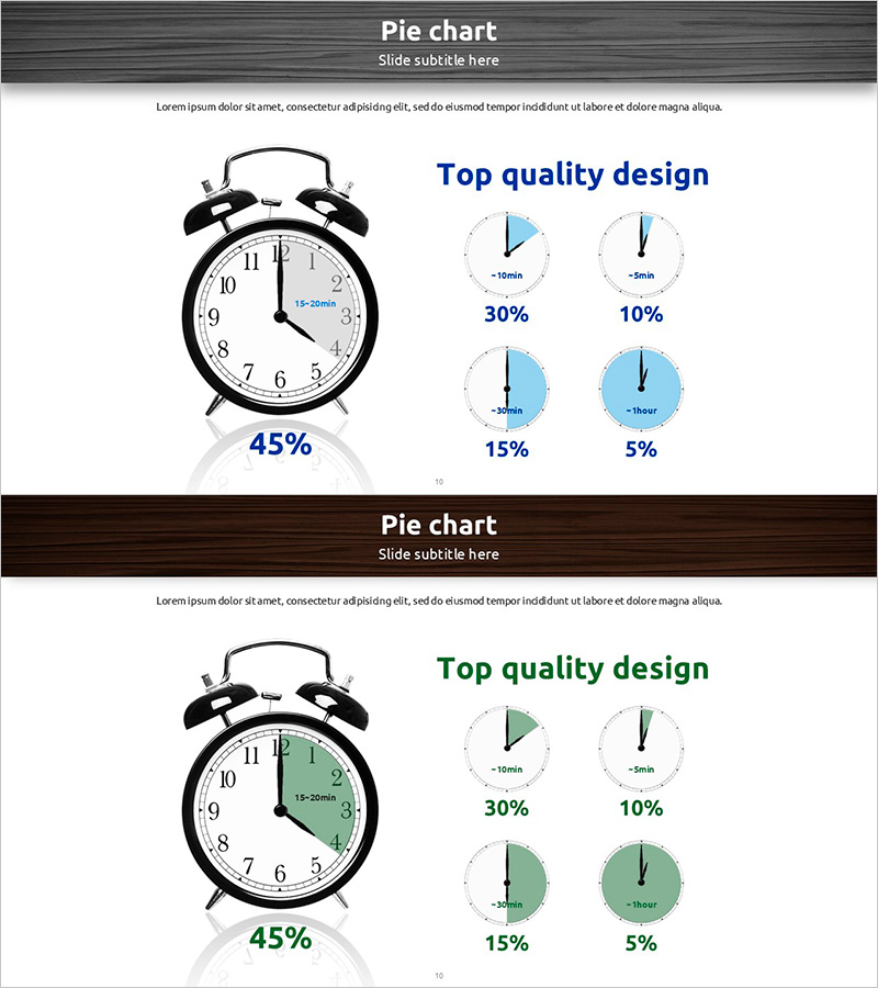
This slide features a graph designed to visually analyze usage status, clearly conveying changes over time. Utilizing a linear graph based on a diagram, it emphasizes the trend of data variations throughout the years. The combination of brown and red colors symbolizes reliability and passion, helping organizations or teams to understand market conditions at a glance. This slide is suitable for various presentations including reports, proposals, and business presentations, and is designed for easy replacement of text and data cells. The overall editing difficulty is rated as 'easy'.
Related Products
-
Target Market Information Box – A Map Unveiling Marketing Strategies
#Marketing Plan and Strategy #Diagram #Other
-
Business Goal Setting Table – The First Step in Business Strategy Development
#Business Vision and Strategy #Financial Plans and Performance #Diagram
-
Visual Trend Analysis through Data Visualization – The Power of Stunning Design
#Company Introduction #Graph #Key Achievements
-
Hourly Pie Chart Slide – Progress and Planning
#Business Management #Graph #Schedule Plan
