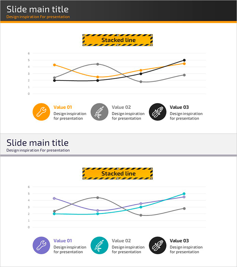
Graph
Tech Safety Curve Graph – The Power of Data Visualization
RJ0900018_25
- Last Update 12/21/2025
- File Size 0.4MB
- # of Slides 2
- File Format PPTX
- Slide Ratio 16:9
- Color
About the Product
This slide presents key metrics of tech safety in a curve graph format for visual communication. Utilizing three colors - orange, purple, and green - effectively showcases different data aspects with an intuitive and simple layout. This slide is useful for presentations related to technology, safety reports, or statistics on project progress. By clearly visualizing various data points, it aids the audience in easily understanding the information. Text and data areas are easily replaceable, with an overall editing difficulty rated as 'easy'.
Related Products
-

Market Share Donut Graph – Stylish Data Visualization
#Market and Competitor Analysis #Financial Plans and Performance #Graph
-
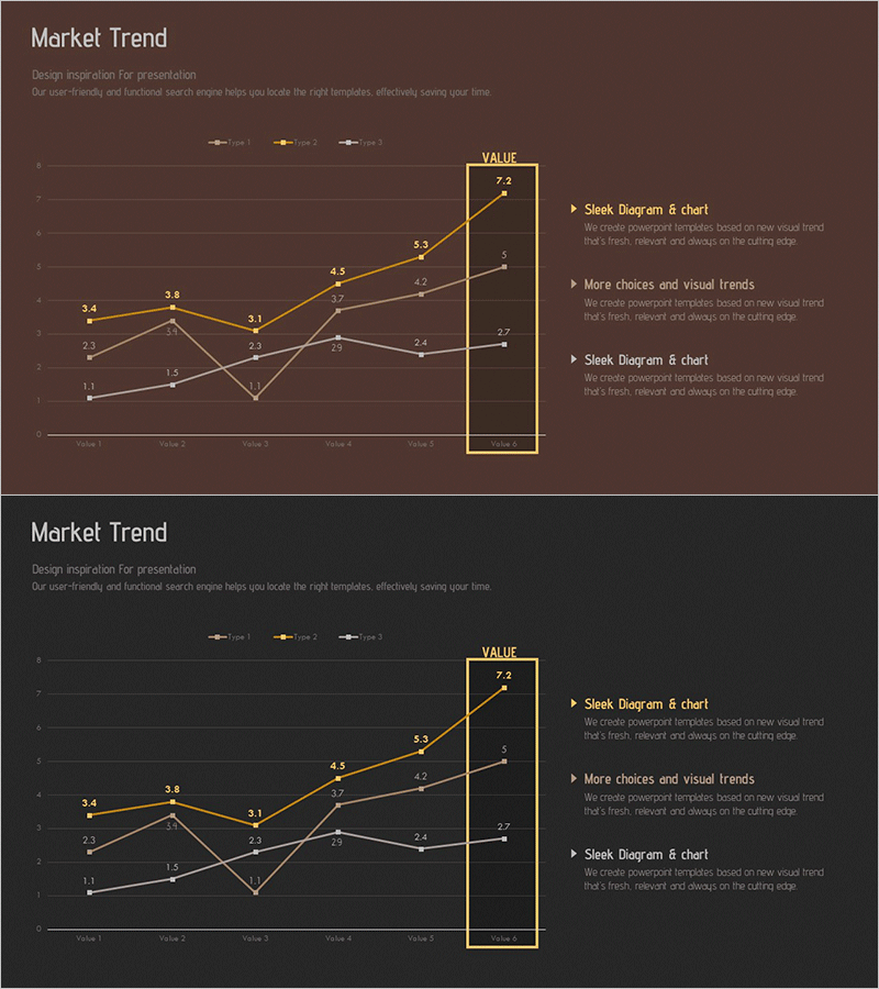
Market Trend Line Comparison Analysis Chart
#Market and Competitor Analysis #Graph #Competitor Analysis
-
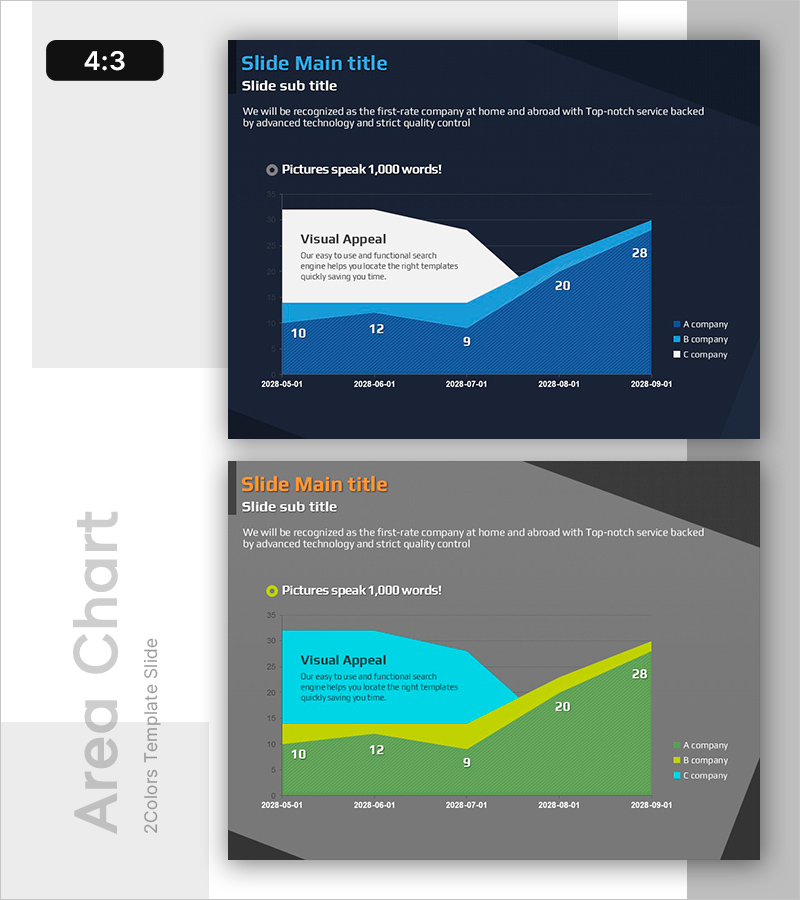
Market Analysis with Area Charts
#Market and Competitor Analysis #Graph #Other
-
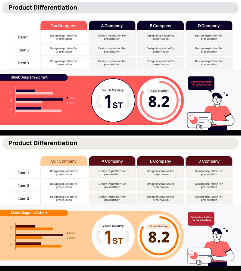
Slide Emphasizing Social Service Strengths through Competitive Analysis
#Market and Competitor Analysis #Graph #Text Box
