
Operation Plan
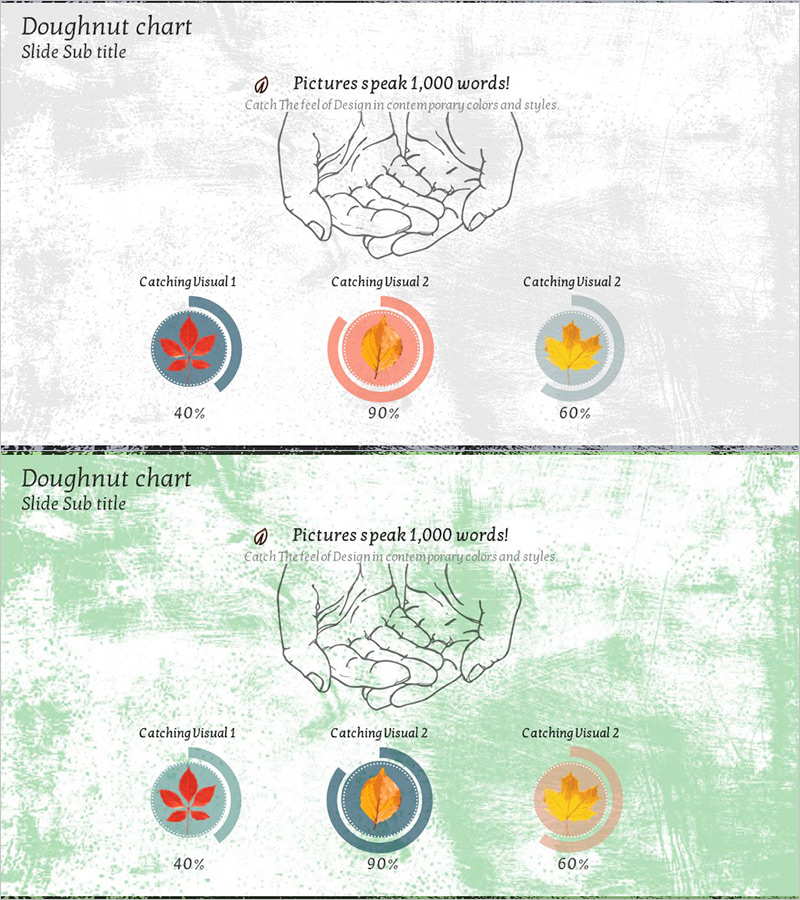
Organization Headcount Doughnut Chart – Visualizing Operational Plans
RJ0900017_6
- Last Update 12/21/2025
- File Size 0.3MB
- # of Slides 2
- File Format PPTX
- Slide Ratio 16:9
- Color
Keywords
About the Product
This slide visualizes the distribution of organization headcount using a doughnut chart. The colors green and orange facilitate intuitive information delivery. This slide is suitable for presentations on organizational management and operational plans, providing a structurally intuitive visualization. It effectively communicates content related to leadership, team composition, and workforce management. The editing difficulty is rated as 'easy', allowing for quick substitutions of text and data as needed.
Related Products
-

Market Share Pie Chart – Competitive Market Analysis
#Market and Competitor Analysis #Graph #Market Share
-
Palm Donut Chart – Market Share and Data Visualization
#Market and Competitor Analysis #Graph #Market Share
-
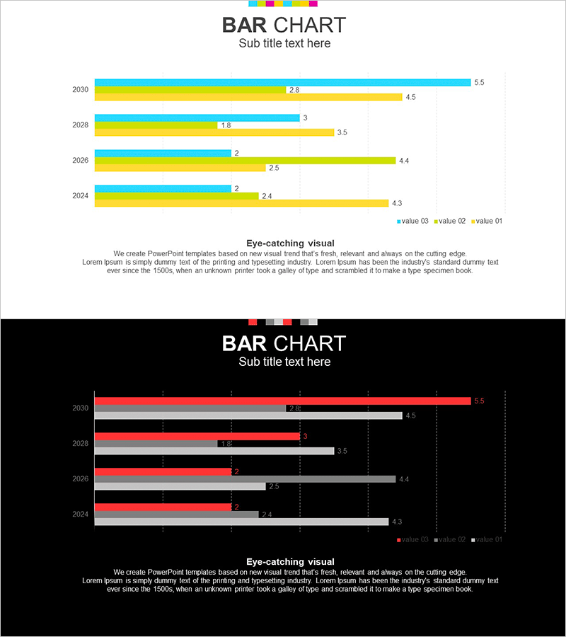
White Black Bundle Horizontal Bar Graph
#Market and Competitor Analysis #Graph #Market Analysis
-
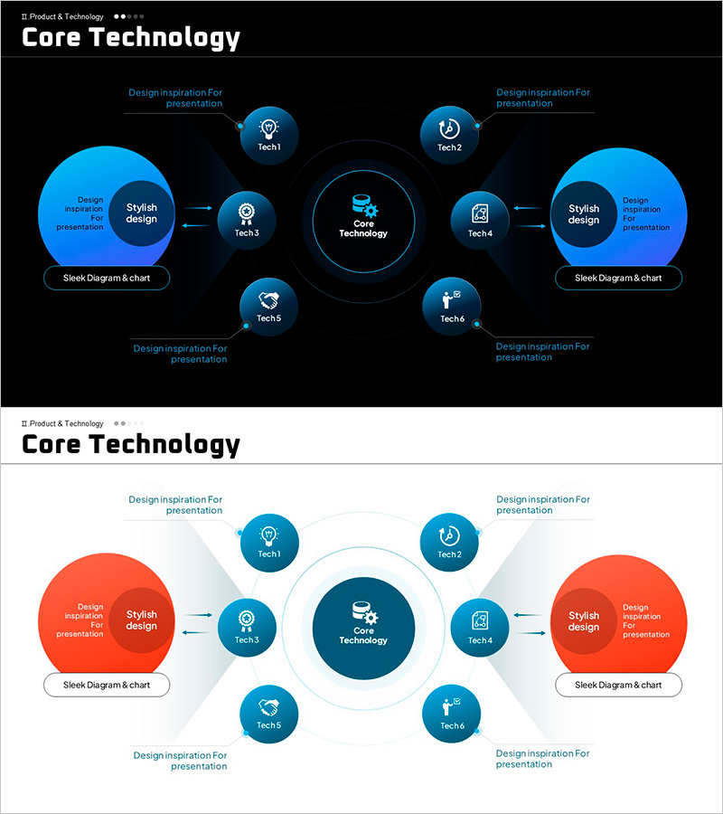
Core Technology & Solutions – Visualization of Risk Management
#Operation Plan #Diagram #Risk Management
