Product/Service
Solar System Illustration Timeline Diagram – Visual Data Analysis
RJ0700003_26
- Last Update 12/21/2025
- File Size 0.5MB
- # of Slides 2
- File Format PPTX
- Slide Ratio 16:9
- Color
Keywords
About the Product
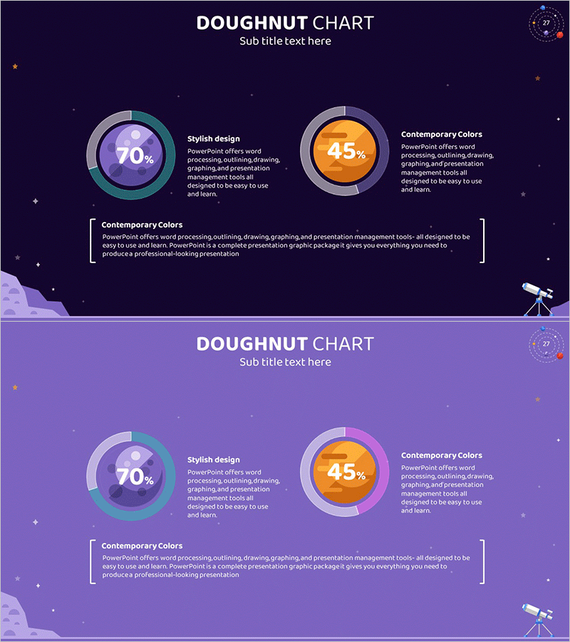
This slide features a doughnut chart visually depicting the timeline of the solar system. Utilizing a rich color palette of navy, purple, and teal to represent the mysterious universe, the segments at 70% and 45% effectively communicate the proportions of different elements. It is perfect for product/service introductions and market analysis materials. By providing intuitive visual elements, it enhances the quality of presentations with clear information delivery. The text and data sections are easy to edit, making the overall editing difficulty 'moderate'.
Related Products
-
Travel Destination Infographic Market Share – Intuitive Data Visualization
#Market and Competitor Analysis #Graph #Market Share
-

Sugar Usage Analysis Pie & Bar Graph Slide Template
#Market and Competitor Analysis #Graph #Market Analysis
-

Effectiveness of Planterior Design – Capturing Innovation in Spaces
#Product/Service #Diagram #Program Introduction
-
Market Share and Analysis Graph – Red and Blue Integration
#Market and Competitor Analysis #Graph #Market Share
