Operation Plan
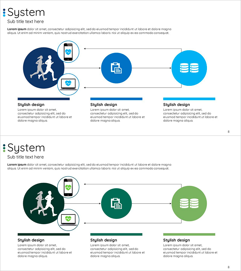
How to Measure Smart Health – Visualizing Effective Data Flow
RJ0600017_7
- Last Update 12/21/2025
- File Size 0.2MB
- # of Slides 2
- File Format PPTX
- Slide Ratio 16:9
- Color
Keywords
About the Product
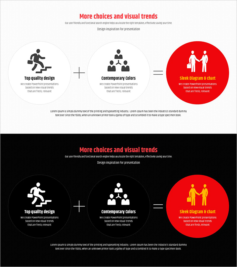
This slide presents the methods to measure smart health visually. It utilizes a flow and connection structure that helps the audience easily comprehend the data flow. The design incorporates two main colors (blue and green), adding stability and trust. This slide is beneficial for various business or technical presentations in the healthcare sector, including service operation strategies. Text and icons can be easily replaced, and the overall editing difficulty is rated as 'easy', making it suitable for fast integration into various presentations.
Related Products
-
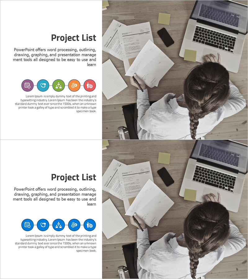
List of Business Projects – The Beginning of Efficient Management and Analysis
#Product/Service #Business Introduction #Diagram
-
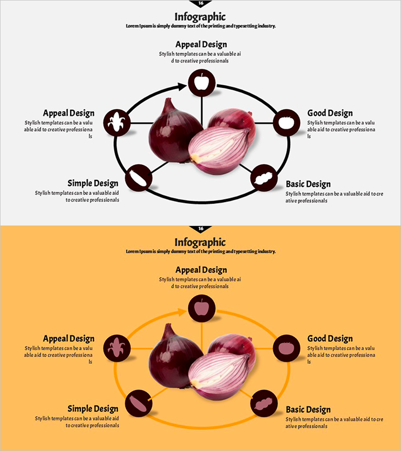
Onion Circulation Diffusion Diagram – Technical Section and Service Structure
#Product/Service #Technology Sector #Diagram
-
Dawn City Theme Competitor Analysis Graph – Understanding Market Trends
#Market and Competitor Analysis #Diagram #Graph
-
Clear Representation of Sales and Marketing Strategy with Cluster Diagram
#Business Promotion Strategy #Marketing Plan and Strategy #Diagram
