Technology Sector
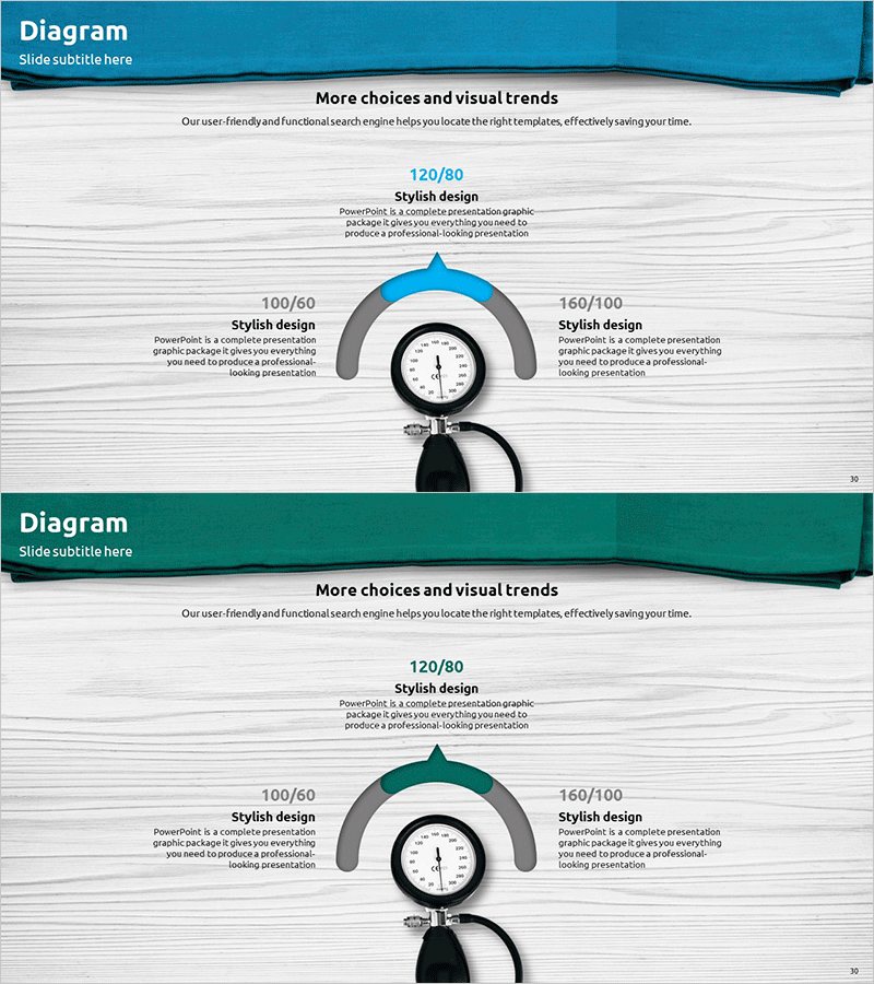
Blood Pressure Measurement Comparison Diagram
RJ0400045_29
- Last Update 12/21/2025
- File Size 3.1MB
- # of Slides 2
- File Format PPTX
- Slide Ratio 16:9
- Color
Keywords
About the Product
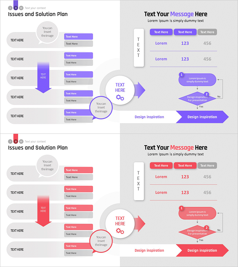
This slide features a comparison diagram designed to represent various blood pressure readings. It visually showcases different blood pressure ranges while maintaining a professional appearance and intuitive layout. Ideal for presentations in the medical field, research reports, and healthcare management systems, it utilizes a harmonious blend of blue and green colors to convey stability and trust. The slide allows for easy replacement of text and graphic elements, with an overall editing difficulty rated as moderate.
Related Products
-
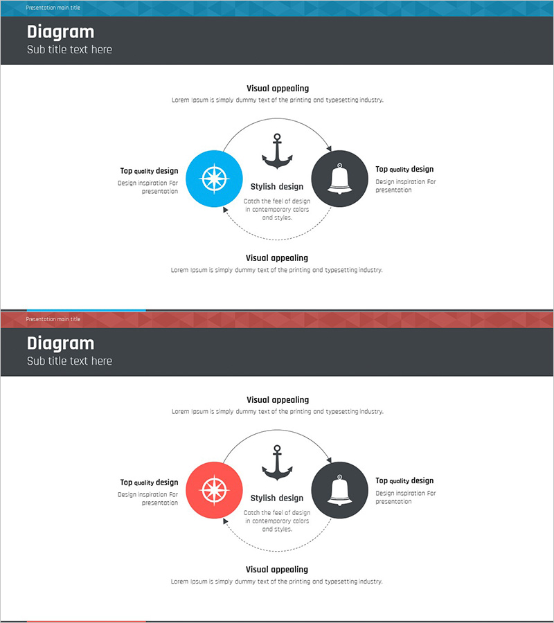
Sailing Travel Business Vision Diagram – Capturing Future Vision
#Operation Plan #Technology Sector #Diagram
-
Business Service Implementation Plan Slide Template – Stylish and Functional
#Technology Sector #Text Box #Service Implementation Approach
-
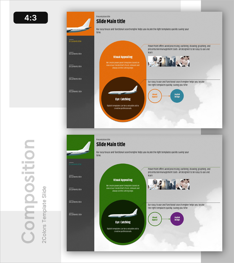
Efficient Slide for Flight Operation Plan
#Product/Service #Technology Sector #Diagram
-
Solution System Configuration Diagram – Multi-Dimensional Problem Solving
#Operation Plan #Technology Sector #Diagram
