Business Promotion Strategy
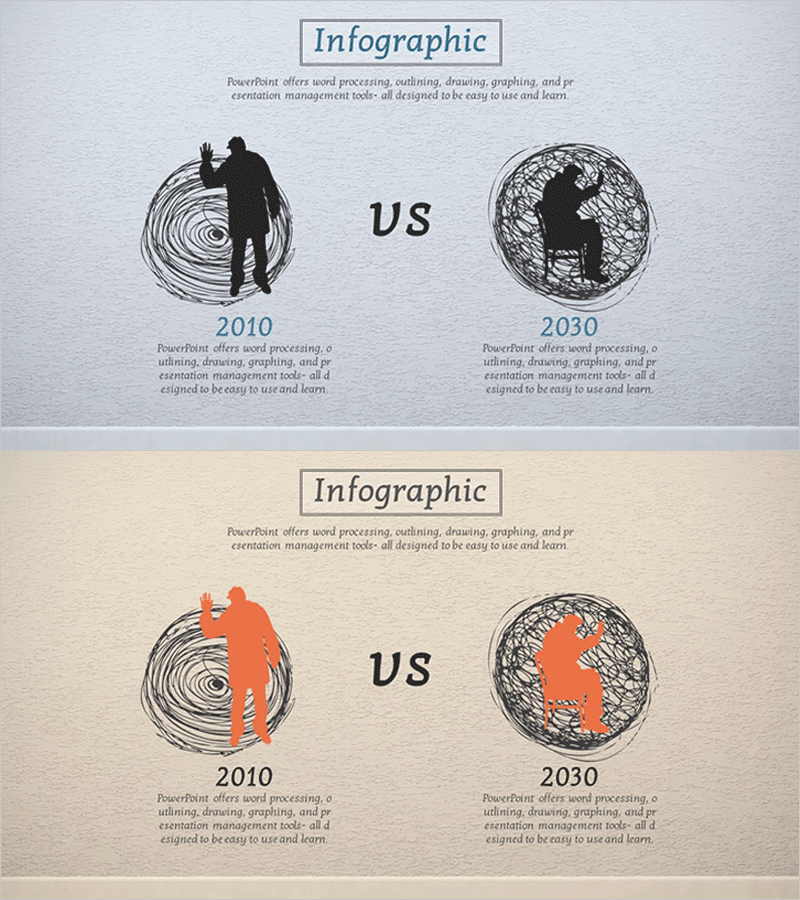
Comparison of Aging by Year Diagram – Analysis for the Future
RJ0400032_14
- Last Update 12/21/2025
- File Size 8.3MB
- # of Slides 2
- File Format PPTX
- Slide Ratio 16:9
- Color
Keywords
About the Product
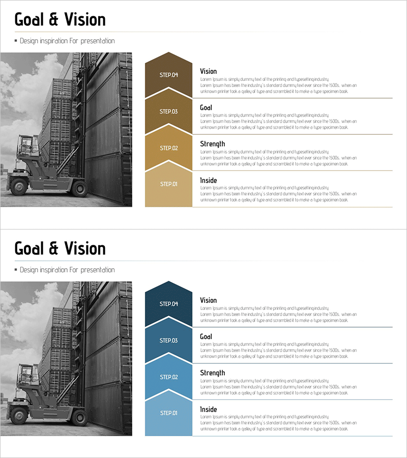
This slide features a diagram comparing aging by year effectively. The clear and intuitive visual structure highlights the aging processes of 2010 and 2030, providing valuable insights to the audience. The harmonious colors of navy, gray, and brown enhance the effectiveness of information delivery, making it suitable for business meetings, strategic discussions, and market analysis. The content is easy to replace, with an editing difficulty rated as 'medium', allowing for quick adaptation to various presentations.
Related Products
-
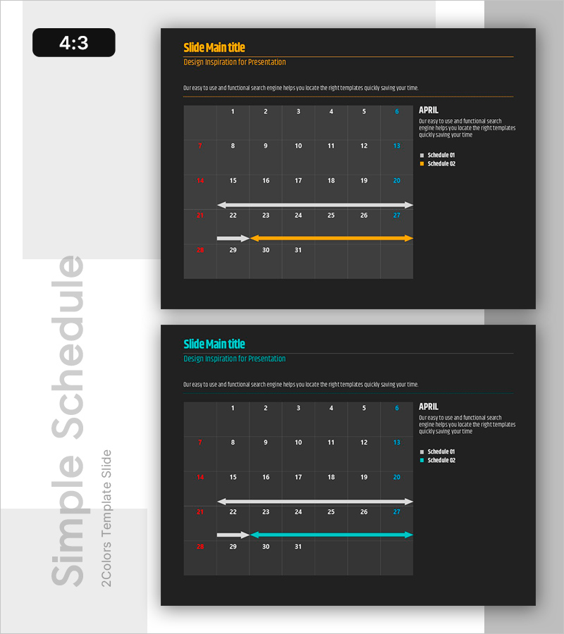
Organize Your Schedule: A Free Timetable - Efficient Schedule Management
#Diagram
-
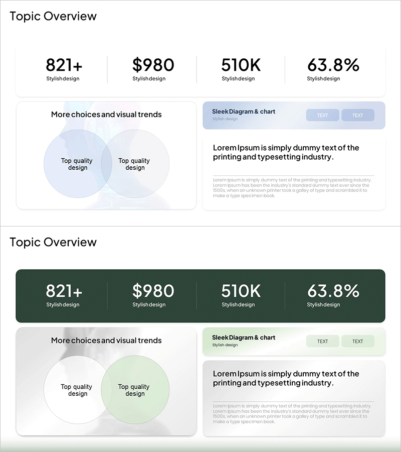
Pastel Gradient Business Overview – A New Perspective on Business
#Company Introduction #Business Introduction #Diagram
-
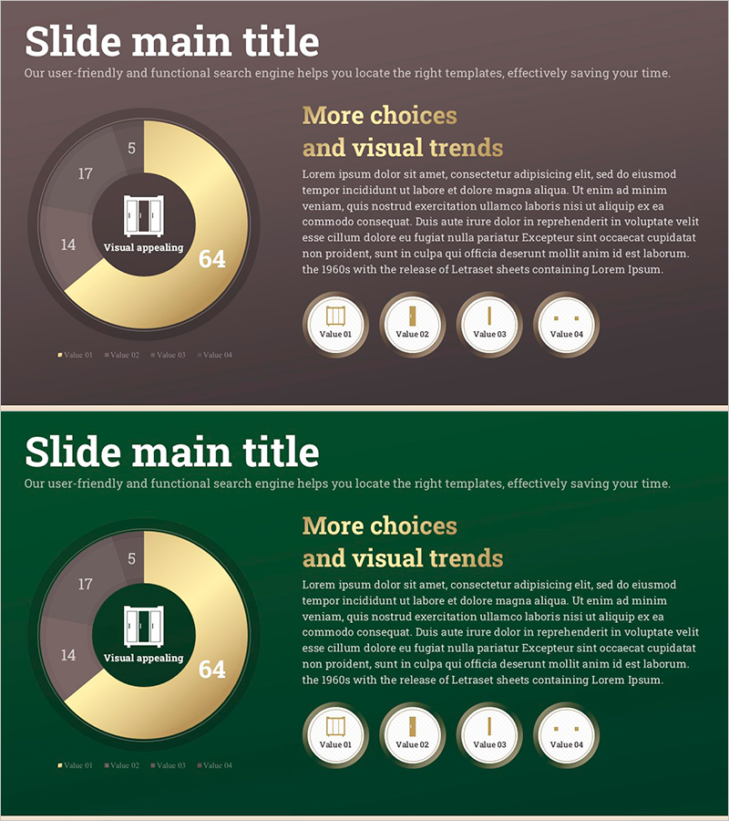
Donut Chart Slide for Interior Demand Survey
#Market and Competitor Analysis #Financial Plans and Performance #Graph
-
Goal & Vision STEP4 Diagram – Designing the Future of Your Business
#Company Introduction #Business Vision and Strategy #Diagram
