Market and Competitor Analysis
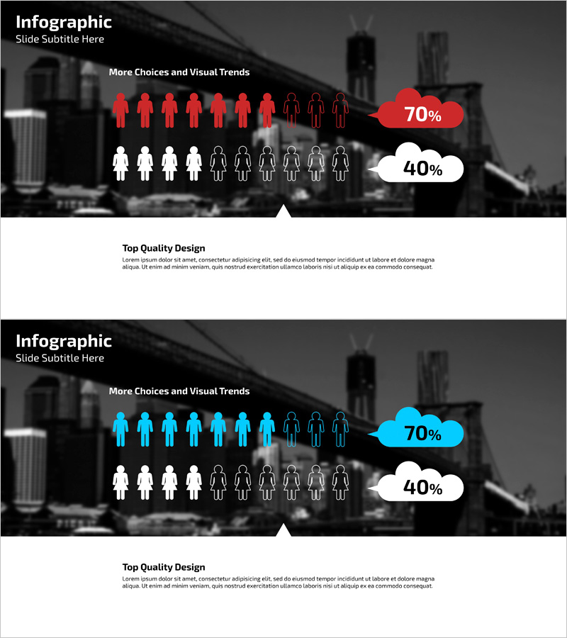
Service User Ratio Analysis Infographic – Red and Blue
RJ0400028_12
- Last Update 12/21/2025
- File Size 1MB
- # of Slides 2
- File Format PPTX
- Slide Ratio 16:9
- Color
Keywords
About the Product
This slide features an infographic design for analyzing customer ratios, utilizing red and blue colors to visually convey percentage data effectively. The simple composition with large cloud icons highlights user ratios intuitively. This slide is ideal for market and competitive analysis or customer analysis presentations, making it a striking part of reports or presentations. The infographic communicates data effectively through intuitive visual elements, and it boasts easily replaceable content, with a straightforward editing structure rated as 'easy'.
Related Products
-
Surgical Site Analysis Graph – Market and Competitive Analysis
#Market and Competitor Analysis #Graph #Competitor Analysis
-
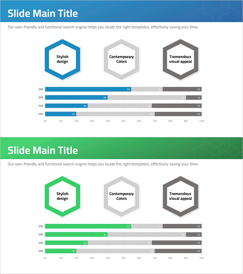
Hexagon Diagram & Horizontal Bar Graph – Elevating Visual Appeal
#Product/Service #Market and Competitor Analysis #Graph
-
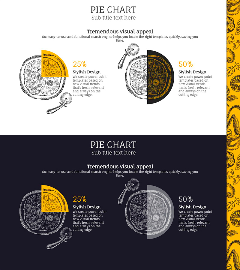
Pizza Illustration Highlight Pie Chart – Market Share Analysis
#Market and Competitor Analysis #Graph #Market Share
-
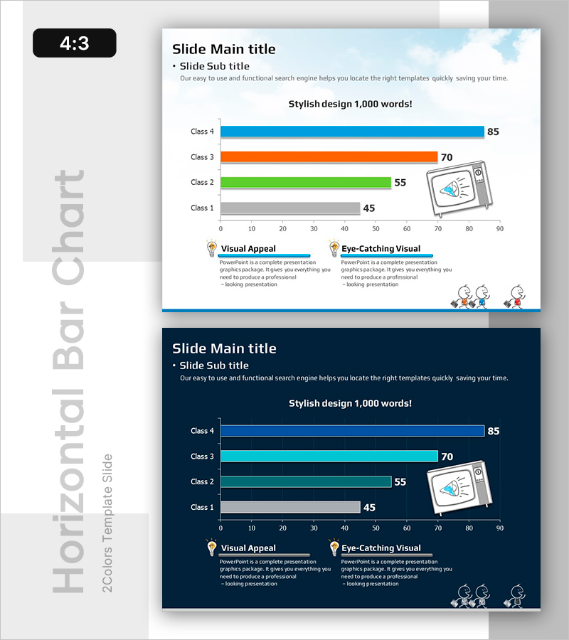
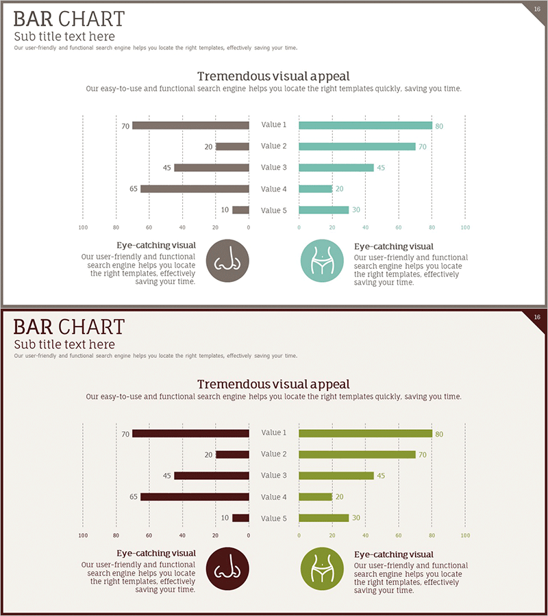
Bar Chart for Class Evaluation Results – Visual Appeal and Eye-Catching
#Market and Competitor Analysis #Graph #Market Status
