Bar Graph for Market Analysis – Emphasizing Competitiveness
RJ0300003_8
- Last Update 04/20/2025
- File Size 0.8MB
- # of Slides 2
- File Format PPTX
- Slide Ratio 16:9
- Color
Keywords
- #Content-Based Slides
- #Design-Based Slides
- #Market and Competitor Analysis
- #Graph
- #Competitor Analysis
- #Market Analysis
- #Column
- #Grouped Column
- #16:9
- #clustered column chart PowerPoint
- #bar graph slide template
- #data comparison chart
- #market analysis PowerPoint slide
- #competitive analysis presentation
About the Product
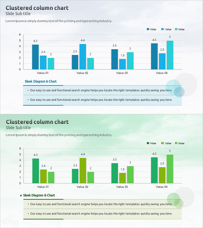
A clustered column chart PowerPoint slide optimized for market analysis and competitive benchmarking presentations. This template displays four data series side-by-side across four value categories, enabling clear visual comparison of performance metrics. The design uses a blue, light blue, and lime green color palette to distinguish each series, with precise numerical labels above each bar for data accuracy and credibility. The 2-slide set includes two background options—light gray and light green—accommodating various presentation themes. Formatted in 16:9 widescreen ratio and fully editable PPTX, allowing you to input your own data and customize the chart instantly.
Usage Points
-
Main Usage
Visualize multi-series quantitative comparisons in market analysis reports, such as competitor performance metrics, product sales by quarter, or regional revenue distribution. The color-coded series and numerical labels above each bar make data relationships immediately clear and support data-driven decision-making.
-
How to Use
Replace Value 01–04 labels with your comparison categories and input corresponding numerical values for each of the three data series. The blue, light blue, and lime green colors are preset; you can modify them globally via the theme color settings if needed. Add analysis insights or conclusions in the text box below the chart to complete the slide.
-
Recommended For
Marketing teams presenting competitive market positioning, sales teams reporting quarterly performance, executive dashboards showing KPI comparisons, and consulting firms delivering benchmarking analysis. Suitable for any business presentation requiring multi-dimensional quantitative comparison.
-
Slide Structure
2-slide template. Each slide features a clustered column chart with 4 value categories (Value 01–04) and 3 data series, totaling 12 bars arranged in grouped clusters. Layout includes title and subtitle area at top, chart area in center, and text box area at bottom. Slide 1 has light gray background; Slide 2 has light green background.
Related Products
-

Vertical Bar Chart for Future Growth Prediction – Innovative Vision
#Market and Competitor Analysis #Graph #Competitor Analysis
-

Competitor Brand Product Comparison Analysis Graph
#Market and Competitor Analysis #Graph #Competitor Analysis
-

Comparative Analysis Vertical Chart – Market and Competitor Analysis
#Market and Competitor Analysis #Graph #Competitor Analysis
-

Pill Market Analysis Vertical Bar Graph – Clear Visualization of Market Status
#Market and Competitor Analysis #Graph #Competitor Analysis
