Analyzing Trends with Line Graphs – Slide for Experts and Beginners
RB0800016_12
- Last Update 03/20/2025
- File Size 2.7MB
- # of Slides 2
- File Format PPTX
- Slide Ratio 4:3
Keywords
About the Product
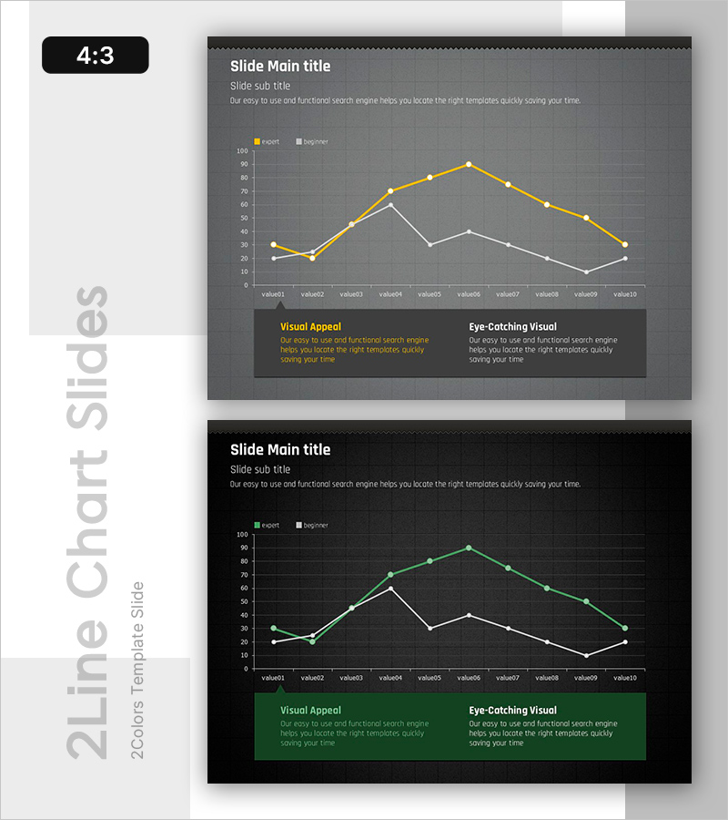
A 2-slide PowerPoint presentation featuring line graphs for trend analysis, designed for both experts and beginners. The slides display dual-series data comparison with yellow and white lines on a dark gray background, tracking 10 data points to clearly show progression patterns. Grid background and legend are included, making it immediately applicable to financial reports, market analysis, and performance evaluation presentations. Available in 4:3 aspect ratio PPTX format, fully editable in all PowerPoint versions.
Usage Points
-
Main Usage
This slide effectively visualizes time-series data progression through dual-series comparison. It communicates key insights in presentations requiring trend analysis such as revenue changes, market share fluctuations, and performance metric comparisons. Grid and legend support numerical interpretation.
-
How to Use
Apply to financial reports' performance analysis sections, market research presentations' trend analysis, and business plans' forecast data visualization. Slide 1 features gray tones while Slide 2 uses black tones, allowing selection based on your presentation's color scheme. Directly input data values for immediate use.
-
Recommended For
Finance professionals, marketing analysts, executive report managers, consultants, and academic presenters requiring data-driven decision support. Particularly effective for quarterly/annual performance analysis, competitive benchmarking, and market trend explanations.
-
Slide Structure
Slide 1 (gray background): Title area + subtitle + 10-point line chart (yellow and white dual-series) + legend + two bottom text boxes (Visual Appeal and Eye-Catching Visual). Slide 2 (black background): identical structure with green-toned lines. Each slide organizes information across four layers: title, subtitle, chart, and descriptive text.
Related Products
-

Sales Strategy PowerPoint Slide – 4-Framework Client Hub
#Product/Service Introduction #Business Vision and Strategy #Diagram
-

Campaign Goals & Funnel Outcomes Slide – Blue & Green
#Business Strategy #Marketing Plan and Strategy #Diagram
-

Brand vs. Competitor Messaging Slide – 3-Point, Blue & Green
#Product/Service Introduction #Market and Competitor Analysis #Benefits and Advantages
-

Business Problem Analysis PowerPoint Slide – 4-Node Cycle
#Business Vision and Strategy #Operational Plan #Diagram
