Red Orange Corrugated Line Graph – Clear Data Comparison
RB0800005_9
- Last Update 03/18/2025
- File Size 1.9MB
- # of Slides 2
- File Format PPTX
- Slide Ratio 4:3
- Color
Keywords
About the Product
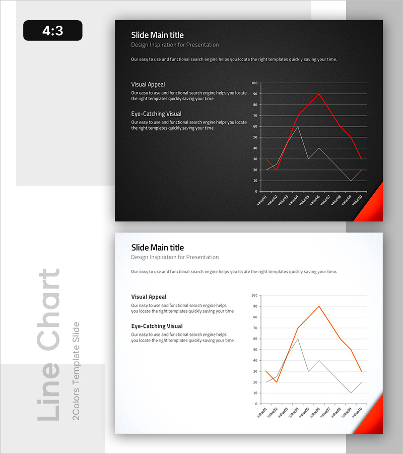
A 2-slide PowerPoint presentation featuring a multi-line graph in red and orange tones for comparing multiple data series over time. The layout combines a left text section for analysis content with a right chart area displaying trend data, making it ideal for performance reports, financial presentations, and business analysis. The dual-column design allows you to input analysis titles and descriptions on the left while visualizing comparative metrics on the right. Provided in 4:3 aspect ratio PPTX format with fully editable elements for immediate use in reports and presentations.
Usage Points
-
Main Usage
Visualize and compare multiple data series across time periods to support data-driven decision-making. Ideal for displaying sales trends, customer satisfaction scores, market share changes, and other key performance indicators simultaneously on a single slide.
-
How to Use
Enter analysis titles and descriptions in the left text area, then input your actual data into the right chart section. Use the red line for primary metrics and orange/gray lines for comparative data to create visual emphasis and highlight key insights.
-
Recommended For
Finance teams, marketing managers, executives, and business analysts presenting quarterly reports, financial statements, market analysis, investor presentations, and performance reviews. Suitable for C-suite briefings and data-driven strategic discussions.
-
Slide Structure
Two-slide deck with each slide divided into left text input area (title plus 2-3 lines of description) and right line graph section. The chart includes three data lines (red primary metric, orange and gray comparison metrics), Y-axis numerical values, and X-axis time labels—all fully customizable.
Related Products
-

Contact Closing PowerPoint Slide – Interior Dark Two-Column
#Company Introduction #Contact Information
-

Project Overview PowerPoint Slide – 4-Spec Dark Real Estate
#Product/Service Introduction #Business Strategy #Diagram
-

Problem Definition PowerPoint Slide – 4-Step Flow Diagram
#Company Introduction #Business Strategy #Diagram
-

Procurement Table PowerPoint Slide – Item Photo Budget Dark
#Product/Service Introduction #Financial Plans and Performance #Features
