Blue Red Vertical Bar Graph for Data Visualization – Suitable for Information Delivery
RB0800003_6
- Last Update 03/17/2025
- File Size 0.1MB
- # of Slides 2
- File Format PPTX
- Slide Ratio 4:3
- Color
Keywords
About the Product
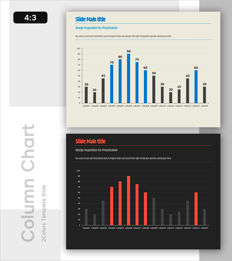
A vertical bar chart PowerPoint slide optimized for data visualization and comparison. This slide presents 15 data points in two contrasting colors—blue and red—making it easy to compare values at a glance. The package includes two versions: a light beige background for bright, professional presentations and a dark background for high-contrast, executive-level reports. The slide features a title area, subtitle, descriptive text space, and a full-width chart section. Perfect for financial reports, market analysis, performance presentations, and any situation requiring quantitative data communication.
Usage Points
-
Main Usage
This slide visualizes and compares quantitative data using a vertical bar chart format. Fifteen data points are displayed in two distinct colors (blue and red) to highlight comparative relationships. Commonly used for financial metrics, sales performance, market share analysis, and performance comparisons in executive presentations.
-
How to Use
Enter your title and subtitle in the designated text areas at the top of the slide. Replace the chart data with your own numerical values using PowerPoint's built-in chart editing tools. Choose the beige version for bright, professional reports or the dark version for premium investor presentations and executive briefings. Colors and values are fully editable.
-
Recommended For
Finance teams presenting quarterly and annual performance reports, marketing teams analyzing market trends and competitor comparisons, sales teams showcasing performance metrics, executives presenting KPIs to leadership, and investor relations professionals preparing pitch decks. Suitable for any data-driven decision-making presentation.
-
Slide Structure
Two-slide package with consistent layout: title area (top left with blue accent line), subtitle area (top center in gray), descriptive text space (top right), and full-width vertical bar chart (bottom section). The chart displays 15 data points across two series (blue and red bars) in a comparative structure.
Related Products
-

F&B Menu PowerPoint Slide – Circular 4-Step Process Layout
#Operational Plan #Diagram #Business Processes
-

Problem Definition PowerPoint Slide – 4-Step Flow Diagram
#Company Introduction #Business Strategy #Diagram
-

Company Capabilities PowerPoint Slide – 3-Circle Icon Layout
#Company Introduction #Product/Service Introduction #Business Vision and Strategy
-

Customer Reviews PowerPoint Slide – Photo Grid Speech Bubble
#Customer Success Stories #Text Box #Customer Testimonials and Feedback
