Stock Issuance Status Table – Visualizing Performance Metrics
RM0600005_7
- Last Update 02/24/2025
- File Size 0.3MB
- # of Slides 2
- File Format PPTX
- Slide Ratio 16:9
- Color
Keywords
About the Product
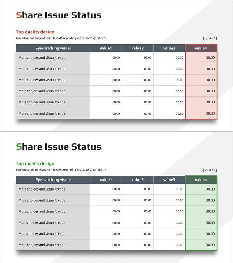
A table-based PowerPoint slide for comparing stock issuance status and performance metrics at a glance. This data organization template features six columns (Eye-catching visual, value1–value4) to clearly visualize performance indicators, achievement figures, and comparative items. The dark header and light row backgrounds create clear information hierarchy, while the final column uses accent colors (red/green) to highlight key metrics. Ready to use immediately in investor reports, financial presentations, business performance analyses, and any presentation requiring quantitative data visualization.
Usage Points
-
Main Usage
A table-based data visualization slide designed to compare and communicate stock issuance status, performance indicators, and achievement figures quantitatively in investor reports, financial presentations, and business performance analyses. The 6-column structure enables simultaneous comparison of multiple items, organizing complex numerical information clearly.
-
How to Use
Enter performance figures, achievement metrics, and comparative items directly into each cell for immediate use. The accent colors (red/green) in the final column visually distinguish positive and negative indicators, while the dark header clearly expresses information hierarchy. Use PowerPoint's basic editing tools to freely adjust colors, text, and row heights to match your presentation style.
-
Recommended For
CFOs, finance managers, investor relations (IR) specialists, business analysts, and executives presenting stock issuance status, financial performance, and business metrics to management, investors, and shareholders. Particularly useful for quarterly earnings presentations, investment pitch decks, and shareholder meeting materials.
-
Slide Structure
Two-slide set in 16:9 aspect ratio, each featuring a 6-column table structure. The header row uses dark gray background with white text for clear distinction, while data rows have light gray backgrounds. The final column (value4) employs red and green accent colors to represent positive and negative indicators, with all cells formatted for numeric and text input.
Related Products
-

Global Warming Solution Presentation Template
#Product/Service Introduction #Business Vision and Strategy #Diagram
-

Core Competency Overlap Diffusion Diagram – Vision for Success
#Company Introduction #Business Vision and Strategy #Diagram
-

PowerPoint Template for Service Operation Strategy Presentation
#Business Management #Operational Plan #Technical Approach
-

Business Plan Template Organization Chart – Clear Role Distribution
#Business Management #Diagram #Implementation Plan
