Market Status Analysis with Donut Chart – Attractive Colors
RM0100020_7
- Last Update 01/31/2025
- File Size 29.9MB
- # of Slides 2
- File Format PPTX
- Slide Ratio 16:9
- Color
Keywords
About the Product
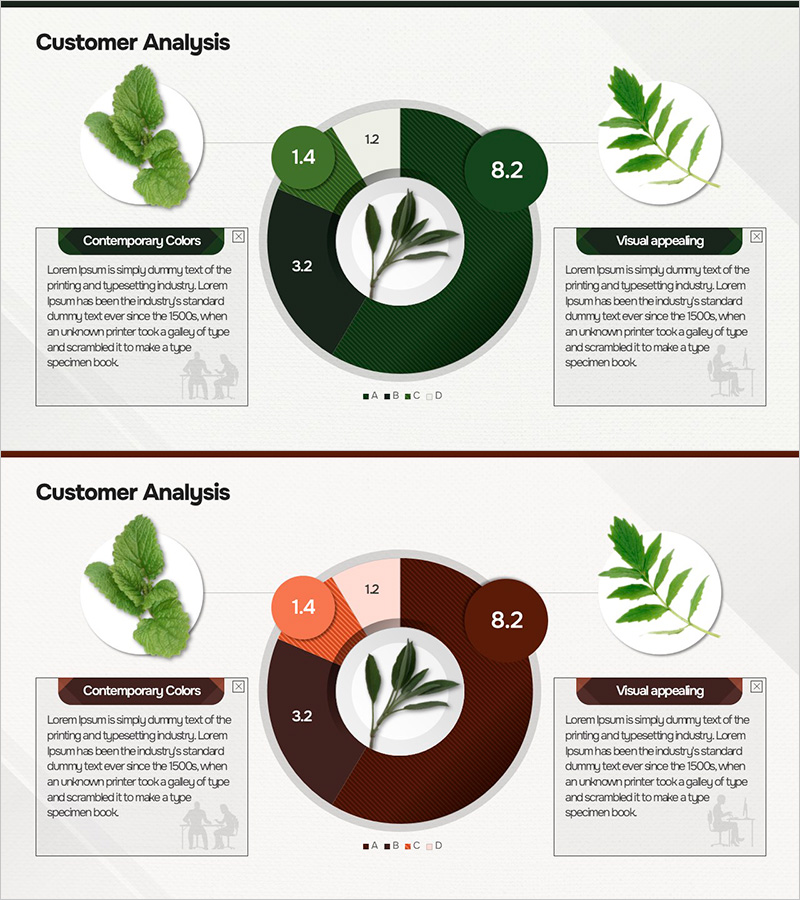
A professional donut chart PowerPoint slide designed for customer analysis and market status visualization. The slide features a central image area surrounded by four data segments, combining visual appeal with clear information hierarchy. The color palette uses natural tones of dark green, orange, and gray to convey a professional appearance while maintaining visual interest. Each segment displays numerical values and labels, making it ideal for presenting market share, customer segmentation, and competitive positioning. The 2-slide set is optimized for 16:9 widescreen format and comes in fully editable PPTX format, ready for immediate use in business presentations, reports, and proposals.
Usage Points
-
Main Usage
This slide effectively presents ratio-based data such as market share, customer segments, and competitive analysis using a donut chart format. The central image area allows for product photos, logos, or icons, while the four surrounding segments display numerical data and descriptions. Perfect for marketing reports, sales presentations, and executive briefings where clear data visualization is essential.
-
How to Use
Simply open the slide and replace the sample data with your own figures and labels. The donut chart segments can be resized and recolored using PowerPoint's shape editing tools. The central image area accepts photos, logos, or graphics. All text boxes are fully editable—adjust fonts, sizes, and colors to match your brand guidelines or corporate standards.
-
Recommended For
Marketing managers, sales directors, business analysts, consultants, and executives presenting market analysis, customer insights, or competitive positioning. Ideal for business plans, quarterly reports, investor presentations, and client proposals where quantitative data needs clear visual communication.
-
Slide Structure
The 2-slide set features a central circular image area surrounded by four data segments (top-left, top-right, bottom-left, bottom-right). Each segment includes editable text boxes for values, labels, and descriptions. The donut chart uses a natural color palette of dark green, orange, and gray to differentiate segments while maintaining professional aesthetics.
Related Products
-

Doughnut Chart Slide for Market and Competitive Analysis – Sports Trends & Strategic Issues
#Market and Competitor Analysis #Diagram #Graph
-

Donut Charts by Technology – Market Status and Competitive Advantage
#Market and Competitor Analysis #Graph #Market Status
-

Achievement Goals and Status Chart – Visualizing Competitive Advantage
#Market and Competitor Analysis #Graph #Market Status
-

Natural Recreation Area Preference Chart – Market Status Analysis
#Market and Competitor Analysis #Diagram #Graph
