Orange Blue Comparative Analysis Graph
RL0100097_7
- Last Update 01/24/2025
- File Size 1.4MB
- # of Slides 2
- File Format PPTX
- Slide Ratio 4:3
- Color
Keywords
About the Product
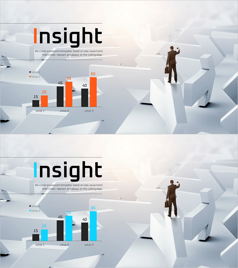
A 2-slide PowerPoint presentation optimized for market analysis and competitive comparison. The design uses contrasting orange and blue colors to clearly distinguish two data series across three metrics (Value 1, 2, and 3), presented as a grouped bar chart. Title area, legend, and numerical labels are pre-formatted for immediate use in business presentations. The 3D geometric background and businessman illustration enhance professional credibility. Available in 4:3 aspect ratio PPTX format, fully editable in all PowerPoint versions.
Usage Points
-
Main Usage
Present quantitative data comparisons such as market share, revenue performance, customer satisfaction scores, or competitive metrics. The grouped bar chart format enables side-by-side comparison of multiple values across different categories, making numerical relationships immediately apparent to your audience.
-
How to Use
Enter your analysis topic in the title area (e.g., Market Share, Sales Comparison, Customer Satisfaction). Update the legend labels to match your data series, then modify the bar values using PowerPoint's built-in chart editing tools. The background imagery and businessman illustration are fixed but can be removed or replaced as needed.
-
Recommended For
Executive reports, investor presentations (IR), marketing strategy pitches, and business plan market analysis sections. Particularly effective for B2B presentations where quantitative evidence supports decision-making and strategic recommendations.
-
Slide Structure
2-slide layout with title area, 2-series legend, grouped bar chart displaying 3 metrics, and 6 numerical labels (range 15–65). Three editable text fields: title and two legend entries. Chart data is fully customizable through PowerPoint's native chart editing interface.
Related Products
-

Come up with an Innovative Idea – Bar Graph for Market Analysis
#Emotional Messages
-

Intro Slide for Asking Ideas – Capturing Innovation and Creativity
#Emotional Messages
-

Imagination Template Intro - Creative Start
#Emotional Messages
-

Young Power Template Cover – Vibrant and Energetic Design
#Emotional Messages
