Analysis Graph of How to Use Leisure Time – Market Share and Trends
RL0100078_3
- Last Update 01/22/2025
- File Size 2MB
- # of Slides 2
- File Format PPTX
- Slide Ratio 4:3
- Color
Keywords
About the Product
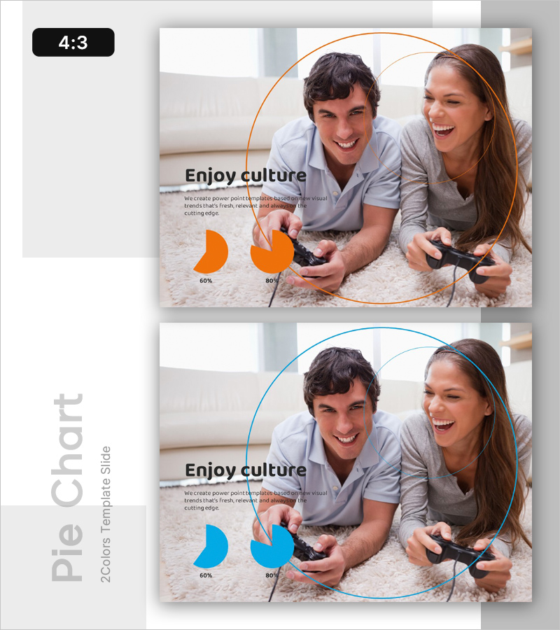
A PowerPoint slide that visually analyzes how people use leisure time through comparative pie charts. The slide features orange and blue pie charts displaying market share and trend data, paired with lifestyle photography to convey the emotional message of 'enjoying culture.' Formatted in 4:3 aspect ratio with 2 slides, this presentation resource is ready for immediate use in marketing reports, market analysis presentations, and consumer behavior studies. Text descriptions, numerical data, and visual graphs are balanced to enhance audience comprehension and engagement.
Usage Points
-
Main Usage
This slide presents consumer leisure time usage patterns through data-driven analysis and visually communicates market share shifts. It is designed for marketing strategy presentations, market research reports, and consumer behavior analysis where key insights about leisure trends need to be emphasized.
-
How to Use
Replace the pie chart percentages (60%, 80%) with your actual research data. Position the left orange chart and right blue chart to show either time-series trends or competitive comparisons, making market changes or competitive positioning clear. Customize the background photo and text areas to match your organization's branding before inserting into your presentation.
-
Recommended For
Marketing professionals, market analysts, business executives, and consumer research teams presenting market survey results. Particularly suited for leisure, culture, entertainment, and consumer goods industries analyzing market share, explaining consumption trends, and comparing competitor performance.
-
Slide Structure
Each slide contains a title section ('Enjoy culture'), centered background photography for emotional credibility, left-aligned text description area (3-4 lines), and two pie charts at the bottom (showing 60% and 80% values). Orange and blue borders visually distinguish the two charts, facilitating comparative analysis and data interpretation.


