Happiness Index Gender Comparison Graph – Scientific Data Analysis
RL0100078_4
- Last Update 01/22/2025
- File Size 2.4MB
- # of Slides 2
- File Format PPTX
- Slide Ratio 4:3
- Color
Keywords
About the Product
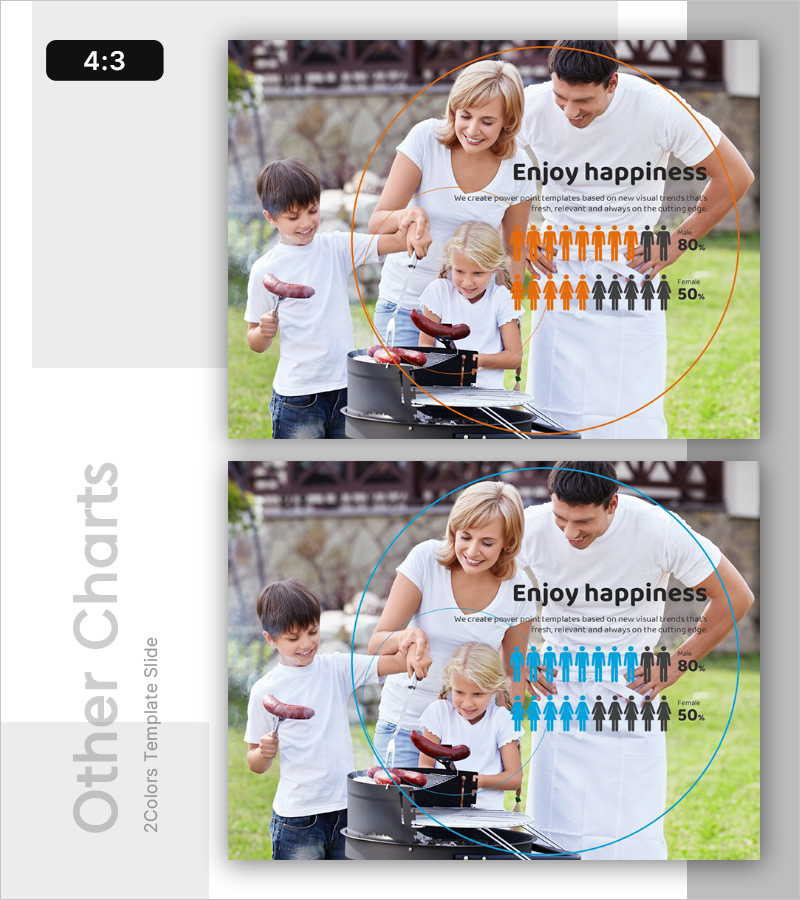
A PowerPoint slide template visualizing happiness index data through gender comparison using dual-color infographics. The slide features orange and blue icons representing male and female demographics at 80% and 50% levels respectively, paired with a family background photo to convey both emotional resonance and data-driven insights. Available in 4:3 aspect ratio with 2 slide variations, fully editable for immediate use in customer satisfaction reports, market analysis presentations, and organizational culture assessments. Clear separation between text input area and graph visualization enables seamless data customization.
Usage Points
-
Main Usage
Visualize emotion and sentiment data through gender-based comparison to support customer satisfaction analysis, organizational culture assessment, and market research presentations. The family background imagery combined with numerical data creates both emotional connection and analytical credibility for stakeholder decision-making.
-
How to Use
Input presentation title and description in the left text area, then customize the infographic percentages (80%, 50%) and colors to match your actual data. Deploy as a comparative analysis section in business meetings, quarterly reports, or marketing strategy presentations for maximum impact.
-
Recommended For
HR professionals, marketing analysts, customer experience researchers, market research specialists, and strategy teams requiring emotion-based data visualization in presentations.
-
Slide Structure
Two-slide set with color variation: Slide 1 emphasizes orange accent, Slide 2 emphasizes blue accent. Each slide features a dual-column layout with left text input area (title and 2-3 descriptive lines) and right infographic area (demographic icon ratio display), creating clear comparative data structure.


