Data Visualization of Competitive Landscape – Power and Strategy
RL0100059_4
- Last Update 01/21/2025
- File Size 1.6MB
- # of Slides 2
- File Format PPTX
- Slide Ratio 4:3
- Color
Keywords
About the Product
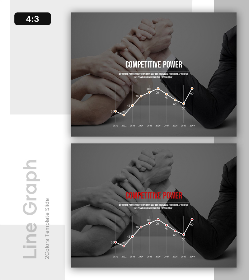
A 2-slide PowerPoint presentation visualizing competitive landscape and market strategy through line graph design. The slides combine a line chart with team collaboration imagery against a gray background, featuring white line data points and orange accent text for strong visual contrast. The timeline spans from 2031 to 2040 with 10 data points clearly marked. Ready-to-use presentation slides with fully editable text and numerical values. Ideal for business analysis, strategic planning, executive reporting, and competitive positioning presentations.
Usage Points
-
Main Usage
Visualize competitive market dynamics and competitive advantage trends using line graph format to support strategic decision-making. The 10-year data timeline clearly demonstrates long-term market positioning, while team imagery reinforces organizational strength and competitive capability messaging.
-
How to Use
Apply in executive briefings, strategic planning sessions, investor presentations, and market analysis discussions when explaining competitive positioning. Customize the chart values and years with your own data, and edit title and descriptive text to match your presentation context and business narrative.
-
Recommended For
Executives, strategy managers, marketing teams, business development professionals, management consultants, and investor relations specialists presenting competitive analysis findings. Particularly effective for demonstrating market share evolution, competitor benchmarking, growth rate trends, and competitive advantage positioning.
-
Slide Structure
Two-slide format with consistent layout: each slide contains one title area, one descriptive text section, and one line graph visualization area. First slide features white title text, second slide uses red title text for visual variation, while maintaining identical graph structure for cohesive presentation flow.


