


Renewable Energy Analysis Graph – Visualizing Sustainability
RL0100046_2
- Last Update 01/21/2025
- File Size 6MB
- # of Slides 2
- File Format PPTX
- Slide Ratio 4:3
- Color
Keywords
About the Product
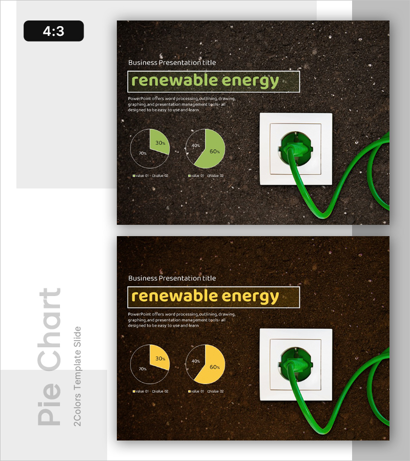
A professional PowerPoint slide for visualizing renewable energy market analysis and sustainability strategy. Featuring a dark brown textured background with lime green accent colors across 2 slides, this design includes two pie charts (displaying 30%-70% and 40%-60% data distributions) on the left side and a green plug icon on the right. The layout clearly separates text and chart areas, making it ready for immediate use in presentations and reports. All data labels and percentages are fully editable in PowerPoint, and the design is optimized for energy, environmental, and corporate sustainability presentations.
Usage Points
-
Main Usage
Effectively communicate renewable energy market share, energy mix composition, and sustainability targets through dual pie chart visualization. Ideal for environmental policy presentations, energy strategy briefings, corporate sustainability reports, and investor relations meetings where quantitative energy data needs clear visual emphasis.
-
How to Use
Replace the sample pie chart percentages (30%, 40%, 60%, 70%) with your actual energy data and update legend labels to match your energy sources (solar, wind, hydro, etc.). The dark background and green accent colors reinforce environmental and renewable energy messaging, so maintaining this color scheme preserves brand consistency and visual impact.
-
Recommended For
Energy companies, environmental consulting firms, government policy makers, investor relations teams, sustainability report authors, academic researchers in renewable energy, corporate CSR departments, and environmental organizations presenting data-driven sustainability initiatives.
-
Slide Structure
Two-slide set with clearly defined sections: title area (upper left), descriptive text zone (upper center), dual pie chart areas (left and center), and visual icon area (right). The comparative structure allows simultaneous presentation of two energy scenarios, time-period comparisons, or different renewable energy portfolios on each slide.
Related Products
-
Introducing a New Innovative Business – Vision and Differentiation Strategy
#Emotional Messages
-
Business Outlook Template Ending Cover – Modern Sensibility
#Emotional Messages
-
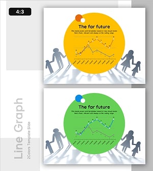
Corporate Future Outlook Analysis Graph – Visualizing Future Predictions
#Emotional Messages
-
Introducing Positive Future Services – Creative Vision
#Emotional Messages