Blue Orange Table Chart – A New Perspective on Data Comparison
RJ0600062_11
- Last Update 07/06/2025
- File Size 3.4MB
- # of Slides 2
- File Format PPTX
- Slide Ratio 16:9
- Color
Keywords
About the Product
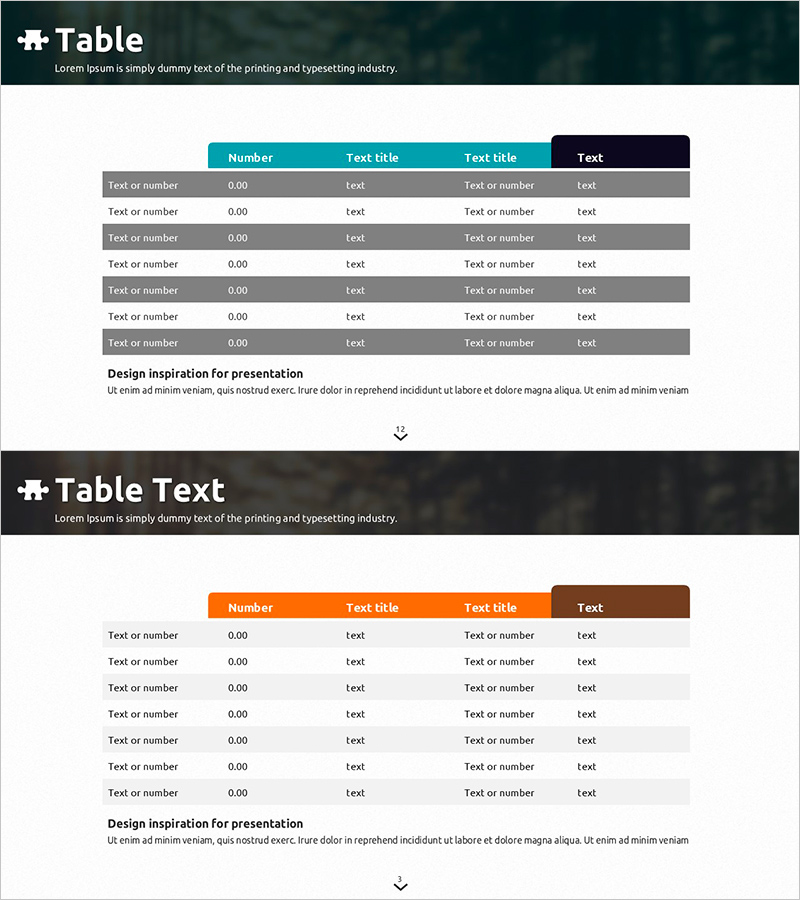
A data comparison table PowerPoint slide featuring teal and orange dual-tone color scheme. The header row displays four column titles, with six data entry rows below for organizing numerical values, items, and descriptions. Alternating row backgrounds in gray and white enhance readability, while the final column features a dark navy background for emphasis. This presentation template is ready to use for business reports, market analysis, performance comparisons, and product specification comparisons where quantitative information needs to be clearly presented.
Usage Points
-
Main Usage
Organize and compare quantitative data systematically using a row-column structure. Designed to display numerical data, item characteristics, and performance metrics at a glance, with clear teal-orange color contrast to emphasize key information.
-
How to Use
Replace header row text titles with your analysis categories and input comparison items and numerical data into the six data rows. Row background colors are pre-formatted with alternating gray and white, so you only need to modify the data. Use the dark navy final column to highlight totals, conclusions, or key metrics.
-
Recommended For
Finance professionals, marketing planners, project managers, and sales representatives presenting quarterly performance, competitor comparisons, product specifications, or budget status. Ideal for data sections in reports, proposals, business plans, and market analysis documents.
-
Slide Structure
Header row (teal background, 4 column titles) + 6 data rows (alternating gray and white backgrounds) + emphasized final column (dark navy background). Each cell accepts text and numerical input. Optimized for 16:9 widescreen format as a 2-slide set.
Related Products
-

Hexagonal Nested Core Diagram – Emphasizing Business Strategy and Features
#Product/Service Introduction #Business Vision and Strategy #Diagram
-

Startup Company Area Diagram – Visualization of Business Introduction
#Company Introduction #Business Introduction #Diagram
-

Business Operating System Infographic Slide – Effective Business Strategy
#Business Vision and Strategy #Business Strategy #Diagram
-

Major Clients Partnerships Diagram – Visual Appeal and Efficiency
#Company Introduction #Diagram #Customers and Partners
