Happiness Index Comparison Graph – Market and Competitive Analysis
RL0100020_3
- Last Update 01/19/2025
- File Size 1.6MB
- # of Slides 2
- File Format PPTX
- Slide Ratio 4:3
- Color
Keywords
About the Product
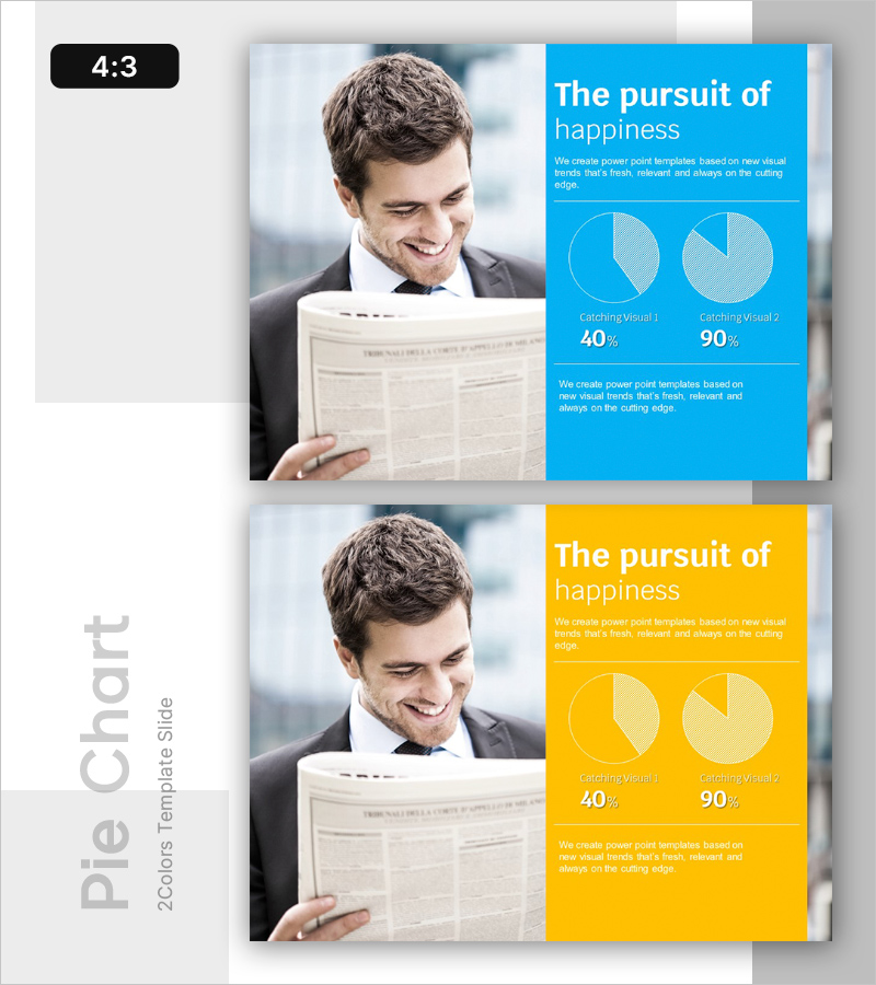
A 2-slide PowerPoint presentation optimized for market analysis and competitive comparison presentations. The layout features a left image area paired with a right data visualization section, using bright blue and warm yellow backgrounds with two pie charts displaying 40% and 90% metrics. This comparative layout clearly communicates performance indicators and satisfaction metrics in a visually intuitive manner. Perfect for emotional and sentiment analysis sections in business presentations, delivered in editable PPTX format for immediate customization.
Usage Points
-
Main Usage
Visualize market trends, competitive performance comparison, and customer satisfaction or sentiment metrics through quantitative data representation. The dual-column layout combining image and chart creates a credible, professional presentation structure for analytical content.
-
How to Use
Integrate into business plans, marketing proposals, and investor pitch decks within market analysis or competitive analysis sections. Simply add your title and description text, replace pie chart percentages with actual data, and the slide is ready for presentation use.
-
Recommended For
Marketing professionals, executives, consultants, and data analysts who support decision-making with data-driven insights. Particularly effective when presenting customer psychology, brand awareness, market share, or sentiment-related metrics in comparative format.
-
Slide Structure
2-slide format with each slide divided into left image area (approximately 40% width) and right data area (60% width). The right section contains title, descriptive text, two pie charts in vertical arrangement, and additional text space below charts for flexible editing and annotation.


